Friday 24 February 2012

Papercrafting Part 3

I was on the Behance Network the other day looking for a link to a piece of packaging design I had seen and as per usual drifted off looking for any new paper crafters that I hadn't seen before.

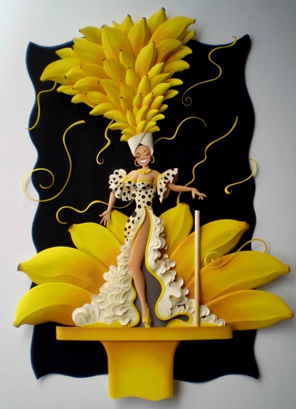
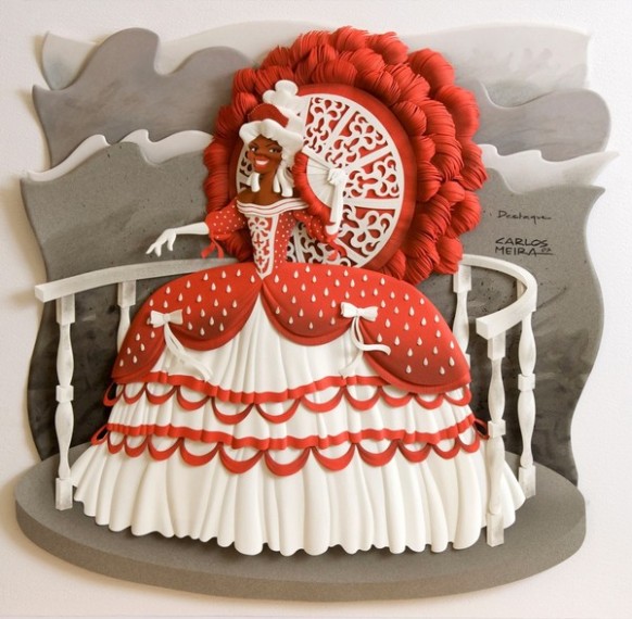
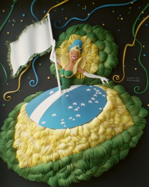
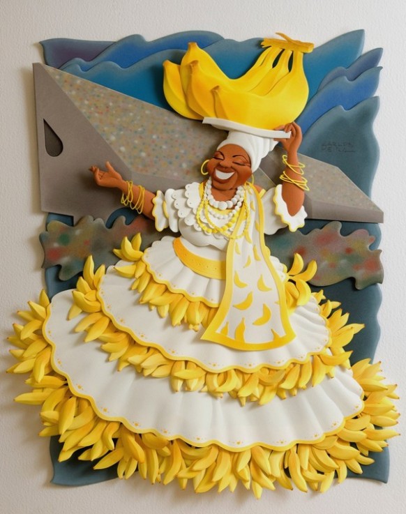
Carlon Meira has amazing paper sculpting skills with such precision and attention to detail. The first series of sculptures are inspired by Brazilian footballers and carnival festivals. The colours jump out at you and appear a lot more three dimensional than they really are. Its just the attention to the cuts and folds that fascinate me.


carnical spectaclethe yellow paper lady 


 the banana paper ladythe red paper princess 

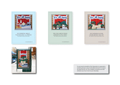
It never fails to amaze me how much diversity can be found in the paper crafting community. One thing I always forget and fail to realise sometimes is that it isn't just a craft to be stuck in a frame. It can be found everywhere as part of advertising campaigns to promote an event or a particular product.


Add caption


The one at the top is for the Federal Bank in Brazil as part of an advertising campaign. The next is for one of his regular clients, a publishing company that deal with book and magazine illustrations. The last group at the bottom are for Mapfre Insurance, who I am guessing are also based in South America judging by the language used.

It just goes to show that getting a brief from an insurance company, would not inspire you at all but if you could come at it from another angle, decline using stock photos and images and you get something fantastic. It got me thinking about making one of my coastal pieces and either approaching someone in a coastal tourism office or creating something myself for my portfolio. I know I am looking into packaging more but it would be great to have the odd commission using my craft skills.


Nice Bit Of Packaging!

I have a few websites that I look at nearly every morning to check whats going on in the world. One of my favourites for the last couple of years has been The Dieline.

So much inspiration in one place. As i am trying to concentrate on packaging design this year, this has been a more frequent destination for visual stimuli. One that caught my eye this week is a new juice drink called Melo. The packaging was designed by Imagemme, based in New York. The idea was to create a mouth watering intuitive package that would attract a thirsty consumer.


The bottle shape is based on a watermelon and is made of a sustainable BPA material, since the type of packaging could alter the taste of the product. It is just a lovely simple considered design and the logo is effectively sweet and unfussy. It's a perfect example of how a simple considered approach can have more impact.


To add a bit of balance, the Design Week website, which as a subscriber, I now have to use instead of having the paper copy drop through the door, which I used to look forward to and is so much better than having to read it off the screen, anyway. I am going to stick my neck out and criticize a piece of design. 


There seems to be a backlash against revamped brands that don't really add any value. Some examples are the recent Design Museum shop rebrand which seems totally unnecessary. Apparently the designers are quoted as saying that the line...


‘symobolises the first mark made in the creation of any design and shows how design is at the core of everything the museum touches’. DM Shop

 I very rarely slate anyone elses work as I always feel that I am not in the position to do so, still being a student. But is this really design to be celebrated? When I see something like this I always think I am being really thick and don't know what I am talking about. Saying that, there is something to be said for the Emperors New Clothes effect. Another recent development has been the apparent leaked design for the new Windows operating system designed by Paula Scher.


New Windows 8 identity

I don't understand why you would want to change such a well known brand and then end up with this. This surely doesn't help with the public perceptions of what designers do for a living and whatever you do , don't mention the Olympics logo. Which as a matter of fact, I quite like.

So, today on the Design Week website, we get to see the exciting new identity for The Associated Press, a major force in the news arena. Apparently the new system will unite all of its businesses under one brand and follows the development and implementation of a master brand strategy in 2010.

New AP identity

Again, I feel like I have missed something here, You know that feeling when you are in a group of people and someone tells a joke and everyone falls about laughing. You laugh because you don't want to feel left out and obviously there must be something wrong with your own sense of humour. Trying to put myself in the clients shoes, sitting there waiting for the design agency to pitch there new idea to me and then being showed this. Would I feel cheated? Was my money really well spent? Surely someone in the office could have knocked this up in half an hour on Illustrator.

Or could they? They must of done there research for such a major client as Associated Press. They probably analysed what had gone before to see the development and strategy behind the past identities. I always wonder if I had the initial brief, would I have come up with something similar, bearing in mind that I hadn't got the above image as a reference. Would I have played it safe or done something radically different? What's probably missing from these designs is not knowing what the client has been saying to the design agency. They must of showed them some development ideas along the way so they could make sure they were on the right track.

We can and always should have an opinion on something we do and don't like but have we missed a vital bit of information? Do we know all the facts? Or to put it bluntly, is it really a load of rubbish?

D&AD Lectures

I have a sort of love, hate relationship with D&AD if I am honest. On the negative side, I feel there is so much more they can do with regards to design education in this country. Yes, they do promote design with their annual design awards but I have always felt that there is way too much credability given to winning a pencil award. It's not even a case of sour grapes either but it may be an age thing! A young designer craves attention and wants the credability that an award brings. It does open doors to certain design studios but I still don't get what all the fuss is about. Plus the ammount of promotion that goes alongside these awards is quite staggering and surely the money could be better spent.

This year they hosted live talks so you could post a message about the brief you were working on and then there would be industry experts who would give you some guidance. I did watch one of them and found that the responses were quite uninspiring but that could have been due to the questions being asked. Also the guests didn't seem that interested anyway.

For me, I don't need awards. I am more than happy for someone to say to me, 'well done' , 'thanks for that' or 'I like what you've done there'. I don't need a bit of plastic to make me feel better. I just think that way too much emphasis is put on winning awards. This has now resulted in a few elite agencies, winning the major clients whilst the rest, who do work just as good or even better, struggling to survive. In part, they have created a secular society within design, the have's and have not's. I have to stress that this is just my own opinion and in no way am I affiliated with any other design awards!

Before I move on, what I would like to see is them implement a better education network that works with all the universities and not just those within the M25. It comes back to that whole credability issue of would they rather work with St Martin's or Ravensbourne instead of Hull or Bristol for example.

So why do I have D&AD near the top of my bookmark list? For me it's all about the President Lecture series they run every year. These events are a fantastic opportunity to hear some very influential, fascinating and inspirational people. Also, because of the relaxed format and location of these events, it also gives you on occasions to meet these people face to face, get something signed, shake their hands and say thank you.

In the past few years I have met some of my inspirations from Angus Hyland, Paula Scher, Wayne Hemmingway to Peter Gabriel and Neville Brody. For me these people are far more interesting than any so called celebrity you can mention. What can be better than hearing Wayne Hemmingway talk about his career and then walk across the road to see and hear him playing Northern Soul.

So, I got sent an email yesterday about some upcoming talks which had me reaching for my credit card. On the 14th March, 50 Years of Looking Forward. In the 1960's a group of designers and art directors formed the British Design and Art Direction. Three of them will be discussing their work and considering what the future holds for the creative industries. Sounded realtively interesting until I saw that it would be BOB GILL, ALAN PARKER and LORD DAVID PUTNAM. How much would you pay to see just one of these people? It's only a maximum of £15. Bargain.

Other events are:
Q&A with David Bailey on the 25th April

Hegarty on Advertising on the 9th May

PechaKucha: Japan on the 23rd May (if its like other Pecha events, it is worth it)

Sir Terence Conran on the 12th June

All fantastic events, well worth going to see. The only minor drawback is that they are in London but thats what the internet is good at, finding cheap fares.

Before I moved on I had a look at some of the other events they run, especially the Workout events. There are some really interesting events with Love Letters to Typography, The Truth About Branding, Writing For Design, Presentation Skills etc. Sounds really good, where do I sign and where do I get tickets from. Until you see how much they cost. On average they are £560! Ouch!

I would love to know who these are aimed at as the price dictates that only industry artists and designers could hope to afford the cost. But when you read some of the descriptions, they would be perfect for design students. Lots of experimenting and finding new ways to construct your ideas and how to deconstruct a brief. So why don't they provide these on a larger scale? Would it still work?

Anyway I have my own yellow pencil sitting on my desk......It's end is a bit chewed, it's an HB and I bought it from WH Smith quite a while ago.......But it's still a yellow pencil.

Alice in Wonderland

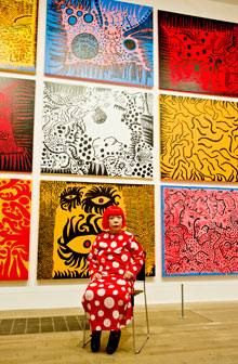
A new version of the classic book Alice in Wonderland by Lewis Carroll came out a few weeks ago. Nothing unusual in that obviously but what made me notice is the new illustrations by Yayoi Kusama. After a little digging, I found that she has an exhibition on at the Tate in London at the moment. This is one of those moments when you find an artist who is exciting and wonder why you had never heard of them before.

Her art practice encapsulates the whole spectrum of media including, film, painting, drawing, mixed media and amazing instalation pieces. It must have been hard growing up in the 1930's and 40's in Japan and wanting to express her artistic tendencies.

 Some of her work is hard to fully appreciate as a flat image, especially with her large soft sculptures known as 'Accumulations" and her 'Infinity Net' paintings with large repeated patterns. It seems very obsessive and a confusing way of working with such an intensity of over decoration. Although, now knowing that she has voluntarily, since 1977, been living in a psychiatric hospital, goes some way to explain her compulsive and obsessive relationship with her art.

 Yayoi Kusama


 She went over to America in the late 1950's and was exhibiting alongside some of the most influential arists of their day, like Andy Warhol, whom she may or may not have influenced in some way. As New York in the 1960's was a mix of sex drugs and rock and roll, she organised parties where they would paint each others bodies with her trademark polka dots. Never one to participate apparently, but as a curator was where she was content. The full article from The Observer, can be found here.

Papercrafting Part 2

The next favourite of mine are Zim and Zou.

They are a French Graphic Design studio who love paper just slightly more than I do! Probably there most recognised project was taking 80's pieces of technology and recreating them in vibrant colours of card, called Back To Basics.

They have a refreshing approach by trying to promote 'real art' in Graphic Design and Advertising and trying to highlight and promote all aspects of real craftmanship. In an interesting article on the Don't Panic website, they mention their aims to show the balance of power between digital and paper production. With this project it does resonate more because I remember when the objects first saw the light of day in the shops and everyone was amazed at the technology. But, it's amazing that in such a short time they have all but disappeared and can even be seen in some museums.

Why I like them so much is that I thought I had a lot of patience when I am crafting something but they take it to a whole new level!

Tuesday 14 February 2012

Updating Portfolio

I have had a busy weekend going through my old portfolio and deciding what to keep and what to add. It always seems such a simple process in theory but it would help if I kept all the files in the same folder so I could find them easier! It was easier to start again and import the individual pictures and rewrite the descriptions as some of them didn't quite read right. Also managed to rethink my current CV and try and condense some of the information so it fits neatly on just one page. Now it has just been a case of emailing them out to studios to try and get some placements or to arrange a visit. Trying to get in contact with some studios in Bristol for next Thursday so I can spend the whole day there and then go to the talk at Spike Island in the evening.


Sunday 12 February 2012

Current Freelance Work

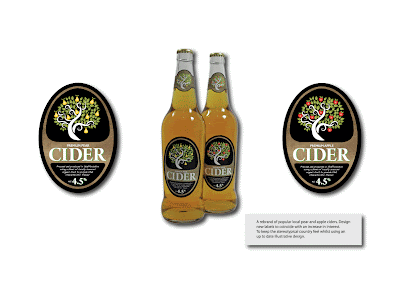
I am trying desperately to finish off some work to put together a revamped portfolio to take with me to some new appointments. The first picture is some labels for a local cider producer. As well as being a very nice drink, the makers are really nice clients to deal with and are extremely passionate about their product which makes any dealings, a pleasure.

The wine labels have been more trouble than they were worth if I am honest. It is always difficult having a client that doesn't really know what they want. twinned with a designer who is still finding his feet. I was left to my own devices with them and to design what I felt would look right. The idea came from scribbles in a notebook and just playing with words to describe the wines like intense and unique taste. This was made even more difficult given that the wine itself isn't that good. As a newcomer to packaging design, it must fill you with more ideas and passion if you believe in the product, or you like the food or drink you are designing the packaging for. The positive aspects that have come from this job are knowing when to say enough is enough. I have lost count of how many reworks have been done to the words, typeface, colours etc etc. But, even though they have been a millstone around my neck the last few weeks, I still quite like them!

Friday 10 February 2012

More Coastal Dreams

I am trying to get a move on with compiling all the ideas for this little venture so I can finish off the website and then start selling a lot more instead of the odd one here and there. As mentioned earlier, here are the tee shirt designs which are shown in blue but come in about 7 or 8 colours.

These designs I want to also use on windbreaks, parasols and mugs. Busy, busy, busy.....


Tuesday 7 February 2012

Coastal Dreams

Whilst Britain has its fair share of problems, it is still the best Country in the world due to its ever changing dramatic coastline. We have it all from fantastic beaches, coastal paths, breathtaking scenery and iconic seaside resorts.
I am always at my happiest at the coast. It's like a wave of wellbeing always seems to envelop me. I could walk for hours looking for fossils or foraging in rock pools and decided last year to try and capture some of that feeling of contentment.

Coastal Dreams started as a photography project first, trying to capture the colours and textures of objects ravaged by the weather. The one problem with this is, instead of taking family shots, I am more happy to photograph peeling paint on a fishing boat or decaying lobster pots. Some of my photographs have been purchased to be used for marketing material, like the one below. The only problem with being reliant on coastal photography is always depending on the weather, so I needed to produce something else which could be produced all year round.

Whilst I was studying my BA Hons in Graphic Design, I rediscovered my love of making things with paper and card. Hence most of my output tended to be craft based, something I would later regret but we all learn from our mistakes.

With this in mind, I have produced a series of artworks which can be purchased as a limited edition handmade version or as a print. The other motivating factor was to be able to help finance my way through my MA along with other freelance design work. I am in the process of establishing a website so we can sell the products online and I have also committed to several, local, craft and art shows, including the Lichfield Medieval Market which has thousands of visitors every year.

We also have a range of clothing in development as well, which should be ready in a month or so. These are utilizing my love of typography and illustration to create a unique product that will hopefully appeal to all ages. Also, there is a range of greeting cards that are being finalized as well as trying to develop a range of windbreaks and parasols with Coastal Dreams artwork on them. There are other ideas scribbled into a notebook which will see the light of day in the very near future and which I will post pictures on here as soon as they are finished.

Below, are just a few of the pictures that will be launching on the new website.......


Creativity Runs Wild in the Studio!

Had a fun afternoon on Friday, with 2 hours of mind manipulating problems requiring quick and concise visual solutions.
The premise was one used at Central St Martins in London and is comprised of a set of different problems or statements, requiring a visual solution whilst adhering to a time limit.
Whilst we were all thinking it was going to be one of those dreaded team building exercises that you get at work, like getting a load of building bricks and having to build something or being given two planks and some string and you have to get yourself and all your team from one table to the other without falling into the imaginary water. This was more challenging but more enjoyable.
The tasks ranged from trying to capture happiness to producing items for the non royalist. In particular, the toilet paper with the queens head on must have been copyrighted already by now.
Below are just a few of the results and as for the standard of drawing, even Da Vinci had to start somwewhere.


Monday 6 February 2012

Now That's What I Call A Manual

I get so frustrated with manuals for modern technology. They are always too technical, too long, too boring and just sometimes, unnecessary. I used to be involved in the audio visual market and had to constantly explain technical pieces of equipment to companies so they could organise training for their employees.

Trying to condense a wealth of technical specifications into an easily recognised and coherent package is never easy. This nicely relates to a fun afternoon spent in the studio trying to make and draw solutions to problems, which is to follow in more detail.

Just how difficult it can be to put into words and pictures, what you are trying to say so that anyone of any age can understand. Until I got sent this link, to what has to be one of the best designed manuals for a mobile phone i have ever seen. Enjoy.....

NOW HOW DOES THIS PHONE WORK.........

Thursday 2 February 2012

Design Organisations


I was talking to some other student designers the other night at the Fraser Muggeridge talk about the D&AD awards and what categories they were entering. They were also discussing some other organisations that they had looked at to join as a professional artist and designer either now or in the future. The general consensus was that whatever the organisation was, it had to either give some credibility to your own work or give you something back in return.
The ones that were mentioned and a few others I have discovered are:

DESIGN BUSINESS ASSOCIATION
Their vision is to promote partnerships between commerce and the design industry to improve the quality of people’s lives with effective design.
Their three main directives are:
Bringing Business To Design
Bringing Design to Business
Bringing Design To Government
They have a core vision to invest in the future of the design industry and to enforce the notion that design is an investment and not just an expense. They believe that the DBA raises the profile of design businesses and gives them the strength and impact to make a difference.
On first glance they seem a good professional organisation to be a part of or even just to keep as a reference as there is a lot of information on their website as well as links to all of its members, which will prove useful for contacts in the industry. It is quite expensive to join with fees starting at £350 + vat for 1 employee right up to £5200 + vat for companies with over 100 employees.


D&AD
Basically the role of D&AD is to inspire, educate and inform those who work in or around the creative industries.
The most recognised part is through their design competitions, which run every year and attract the leading designers in the industry. Their student awards are probably one of the most popular competitions to enter, because as a winner, you get well earned recognition within the industry.
I have been a student member for the last few years and the benefit to me has been the fantastic lecture series that they organize throughout the year and have been fortunate to meet some great designers like Paula Scher, Angus Hyland, Wayne Hemmingway etc, so for that alone it has been worth it.
They also produce education days where you can sharpen your skills and also portfolio surgeries where you can get the best advice for presenting your work.
In short, a worthwhile organisation to join and to keep in touch with the industry.


CHARTERED SOCIETY OF DESIGNERS
The Society is a professional body for designers and an authority on professional design practice. Their unique selling point is that they claim to be the only Society that represents designers in all of the disciplines with members in over thirty countries.
They are a registered charity, which works for the community with accreditation to individual designers, design agencies and also through training. Their existence is explained as promoting the sound principles of design in all areas and to encourage further study of design techniques for the benefit of the community.
Their three stakeholder groups comprise of, design providers, design users and design education.
An interesting date from their history is that the first regional group to be formed was in Stafford, Staffordshire in 1932.
With regards to joining, it might be worth further investigation as the fees are not excessive and to have the recognition of the CSD would also give credibility to you as a professional designer.
Other useful factors are the training they provide, use of recruitment spaces, libraries and again, firm links with the design community.


CREATIVE CHOICES
Creative Choices is aimed at developing your career in the creative and cultural industries. I have included this not as an organisation to join but as a useful resource for information.
There is nearly every sector covered and provides some great information. One section I have been reading was about how much to charge for your work. So it tackles subjects such as raising and managing money, keeping your customers loyal and understanding your customers.
For me personally there are topics covered such as:
Tips For Design Students
Being A Freelance Designer
What Employers Are Looking For
Turning Values Into Profit
Making An Internship Work
Growing Your Creative Business
The list seems endless and seems a fantastic resource to keep an eye on especially with news and views from industry and even a jobs board.


INTERNATIONAL SOCIETY OF TYPOGRAPHIC DESIGNERS
Their purpose is to establish, maintain and promote the standards of typography through debate and design practice.
It seems you have to be granted acceptance through demonstrating the quality of your work and the highest commitment to achieving excellent quality in your visual work.
There is also the possibility of entering their student design competition every year which if you are chosen; you then automatically become a member of the society.
Education seems their main goal and has been that way since 1928 when they were known as the British Typographers Guild. Again, using the annual student assessments, they continue to expand their membership, continually expanding on new ideas for their future.
Having read the brief for 2012, the proposition sounds very interesting but would take more time than I can commit with everything else I have at the moment. An interesting organisation to keep a note of though, for further reference if needed.


DESIGN COUNCIL
Founded in 1944 by Hugh Dalton who was then President of the Board of Trade in Government. Its objective then and now still remains to promote the improvement of design in British Industry.
The latest change has been to join forces with CABE (Commission for Architecture and the Built Environment) who advise on well designed buildings, places and spaces. Now enforcing the importance of design and architecture, they are working to put design at the heart of Britain’s social and economic renewal.
Not so much an association to join but worthwhile including as another excellent resource for insight and networking into the design industry. There is also good information on starting a design business and how to manage clients as just a couple of resources to investigate.
There is also a list of all the design competitions and links to the TED talks, which are another great source of information along with a huge list of Design Blogs.


THE TYPOGRAPHIC CIRCLE
Formed in 1976 to bring together anyone interested in typography. A non-for profit organisation, which is run as well by volunteers.
They organise some great events with speakers ranging from Stefan Sagmeister, Anthony Burrill, Trevor Beatie to some of the major design agencies in the UK today.
The membership entitles you to discounts off their events and also access to some of the member only events. From first hand experience, their events are always well managed and professionally staged plus the organisers themselves are very friendly and approachable.


ALLIANCE GRAPHIQUE INTERNATIONAL
In the 1940’s, different artists of all disciplines started to realise a common thread between their work and the modern profession of Graphic Design began to be defined. The founder’s relationship naturally formed into an association, which shared common interests across national and cultural borders.
In 1952, the AGI was formed with 65 members from 10 countries, originally in Paris and then moved to Zurich in 1969. Then in 1979, student seminars were introduced with the first Young Professional AGI Congress held in London in 1994.
The aims of the AGI are to educate and promote graphic design through publications and lectures with connections to companies and educational institutions.
They seem a very influential organisation and to be asked to become a member seems an honour in your design profession. Again, not one that can be actively joined but another great resource for information as well as the various lecture series produced around the world.


A few others to mention briefly are:
INTERNATIONAL COUNCIL OF GRAPHIC DESIGN ASSOCIATIONS
ACID (Anti Copying In Design)
BRITISH DESIGN INNOVATION
CRAFTS COUNCIL
Wednesday 1 February 2012

Papercrafting Part 1

I spend a lot of time looking at paper craft artists and designers which is where I get a lot of my ideas and inspiration from for my own artworks. This one features Lisa Nilson. A lot of her other work is using found objects and creating what look like memory boxes. Also she is a painter using water based products to create character based images.
What led me to find her paper craft designs, was from a link from another artists website who I will look at in a further Paper crafting entry.
These look simply stunning. Using Japanese mulberry papers to create a 3D representation of anatomical cross sections of the human body. Quilling has been around for many years and has seen quite a resurgence in the last few years as more contemporary artists take the skill and use it to make more modern pieces of work, sometimes using it to make letters to be used in advertising and packaging.

What I love about pieces like this is that they can be treated as stand alone pieces of art or they could be used for an editorial piece on health matters, or a poster for an exhibition on the human body, or as.....well the possibilities are nearly endless.

I think sometimes I fail to see the wider picture when I am thinking about producing some of my paper craft works. I create it for a particular idea and then sometimes forget to expand on the original idea before I have moved on to the next piece. It is something I am trying to consider with my work for Coastal Dreams, where I am producing a picture or a piece of 3D sculpture that could be utilised for something else like a poster, leaflet, piece of packaging design, etc.