So this week has been a very strange one filled with a lot of disappointments. Firstly I didn't get shortlisted for the Design Bridge Student Awards. In hindsight not a surprise judging by the other work that had been submitted. I didn't get the job or placement at Elmwood either or the placement at Purpose. Plus no forthcoming placement at Pearlfisher.
It's always a strange feeling when you get a lot of rejections in such a short space of time that inevitably you do begin to question yourself. Am I still on the right path and is it still worth doing? The answer is a bit fuzzy at the moment. I am under no illusions that I am ever going to be a designer that changes the world or wins awards but I still think I have a place somewhere, it's just hidden at the moment. Part of the problem is not ever being satisfied with what I do and this is something which may never change but I need to adapt so that I can at least partly accept my work for what it is.
For the time being it's full steam ahead for the Lichfield Festival Market which is only two weeks away and I have so much still left to do. Lots of printing, signage, website, leaflets, display etc etc etc. Plus a lot more different designs which are still at the development stage. It will get done in time as I tend to thrive on unnecessary pressure. Time to refocus!
Friday, 22 June 2012
Wednesday, 20 June 2012
Reflective Perspective
To say that I have been doing a lot of thinking lately is an understatement. I think that I have reached another natural crossroads and need to decide very quickly the next steps to take.
The main decision is whether or not to take part in the Lichfield Festival Market. Basically I booked a stall ages ago with the idea to display some of my coastal dreams work. The problem is that to set up a stall from scratch along with making a lot of stock isn't going to come cheap. At the moment I am finding it difficult to get any freelance work in at all. This is the problem with spending a few hundred pounds before we have ever sold anything is proving to be a bit of a stretch on the finances. To be in with a chance of making all the stock needed, a decision has to be made tomorrow at the latest if I have even a remote chance of getting it all finished in time. I do tend to thrive on a deadline but there are limits sometimes.
I have also been trying to get a different job just to bring some money in but every interview I go to they assume I want more money or they say I am over qualified. I never used to have any trouble at all finding work and don't really want to be on the scrapheap at 45! i have even been in touch with some of my old contacts but because I have been out of the field for a while, there is very little chance of being able to jump back in again.
Part of the reason for going on this creative journey was firstly to do something that I enjoy and secondly, something that is not age related so I can carry on working without fully retiring. I have never liked the idea of just giving up when you reach 65 and thought that it could be something I could continue to do indefinitely.
It also comes back to the old adage, speculate to accumulate which I am a firm believer in but not to the point of going bankrupt. Plus, at what point do you decide that you are never going to get a job as a designer and just get any job to pay the bills. The point of doing this MA was that at the end, I had to either be employed in a design studio or have my own freelance studio well on the way.
When I finished my BA, I thought I was on the right track and the future was all mapped out for me but it didn't quite work out that way. Not wanting to be negative in any way but this is sort of becoming the last chance saloon. It is becoming impossible to compete with another outpouring of design graduates all chasing the same few placements. Maybe I am setting my sights too high? I mean, I am tending to only contact the top agencies for placements just like everyone else is because you want to work on recognised brands. Plus it becomes a lot easier having a well known agency on your CV when it comes to finding another job.
As for today, I went down to London again to see Natalie at Pearlfisher. After sending them my updated portfolio, I was asked to attend for an interview. I have seen Natalie before and narrowly missed out on a placement last time so was hoping for a bit more success this time round. After showing my work, we had a discussion about what I wanted and what I hoped to gain in the future. The truth is that I have a set of skills and experiences that just need joining together. To try and put it more simply, I know a bit about typography, a bit about branding, a bit about packaging but I find it difficult to successfully complete a brief, on brief. I don't quite know how to pick a brief apart and transpose that knowledge into the final piece. This means that the finished work isn't as professional as it should be.
Anyway, she then explained that they had all the placements filled for the year and even had some pencilled in for next year. With the way things are financially, this quite annoyed me if I am honest. It has cost me train fares and parking and a whole day just to be told that they have no placements. I could have been told that over the phone. This is the last time that I travel down London just to have a chat unless there is a more promising chance of a placement. I can't afford to keep wasting money like this.
So today, I have decided to change tact. I am going to start concentrating more on promoting my own studio practice with a view to applying for the business start up scheme next year. I will still keep sending my work out to a few chosen studios in the form of a monthly update, sort of like a newsletter. Stop applying for any more placements directly unless I get offered one through these regular updates. I am spending far too much time chasing a dream when I should be concentrating more on reality. I still have Dew Gibbons to go to in July, which I am looking forward to.
I will be making a list tomorrow of all the things that I need to achieve every month. I should have been doing this already but it's not too late to start now. Things like get a website for the coastal dreams work sorted out or look at using sites like Etsy and Not On The High Street. Get a presence on the Behance website as this seems to be a good site for professional designers and could bring in some work from that direction. Improve my skills more using Lynda.com with a possibility of learning some basic web design skills to improve my job prospects in the near future.
This may all sound quite negative but the reality is that you have to constantly be honest with yourself. Things are not happening for a reason and I am the only one who can effect change. The one aspect I am happy with is working on my Masters Degree. I can't wait to get back and see what challenges I am going to face. Early on I didn't think I was going to University to study a BA let alone a Masters, so I am proud of what I have achieved so far which is spurring me on to push myself harder to get what I want.
Right, rant over. Time to finish my glass of wine and fall asleep till the train pulls into New Street.
Friday, 15 June 2012
Blessing Tea Gift Set
I would love to get one of these but sadly they are only available in Asia at the moment.


They comprise of four different teas which have been picked for their premium quality. The design itself really appeals to me with the patterns reminiscent of Chinese designs used on lampshades and window shutters. The die cut is really delicate and illustrates that you do not need any other adornments when you have a considered design as this. Also you can actually use the packaging as a lantern but I would be a bit concerned on how practical this really is. Just need to find out if they ship to the UK.


Crabbies Saucy Solution
Crabbies Ginger Beer has been one of the most successful drink brands of the last twelve months. Due in part to the great advertising campaign of amusing television adverts. I have never actually tried the drink but can remember ginger beer from when I was younger and like a lot of children, we thought we were all grown up drinking real beer!

Now they have extended the brand into a range of sauces using a Ginger spiced base. The packaging itself looks well designed and will look appealing on the shelf.

Changing For Changing Sake
With so many brands in existence today, the market is overcrowded. It's difficult enough trying to keep the consumer interested enough in your brand or product without adding a sense of confusion as well. Whenever a company decides to change their name it always meets with scathing opposition but has Yell taken that wrong step.
The word Yell is so well known that most people don't refer to Yellow Pages anymore and simply use the online version, Yell because as most of us have internet enabled devices of some description close at hand, it can be a lot quicker and more convenient.
But now the name Yell could disappear and be replaced with Hibu. The initial thoughts are going to be what does the word even mean because I for one have never heard of it. Does it have a meaning or has it got a hidden meaning that we are not privy to. This could be part of the problem because seeing a brand mark or logo in isolation can sometimes be misleading. You are not seeing the full picture of the total brand development and where the concept materialised from. Personally I like the logo itself and would like to know more but as a replacement for Yell, I am not so sure.
On the Design Week website this week I saw a piece remarking about the proposed changes. I then noticed an interesting comment posted from Sylvia Saunders from Pearlfisher who I just happen to be visiting next week so will somehow drop this into the conversation at some point. Here is what she said:
At Pearlfisher we always say that names are the start of the conversation. They introduce your brand and are often the first equity that people see, interact with and comment on – as is the case with all personal relationships.
The best names leave an impression and form deep connections with people over time. Even if they are invented that doesn't mean to say they lack meaning.
The story goes that Kodak was a combination of letters that pleased its founder. IKEA too. And seemingly abstract names like Orange, Apple and Virgin are all backed up by a strong challenger reasons that, if not immediately apparent, are built into the brand story over time.
Yell was a seemingly strong and clever adaptation of the famous and much loved Yellow Pages brand. But was it standing the test of time? All brands need to think about their evolution but throwing the baby out with the bath water and, in this case, its most recognised signifier out with the rest of the key equities was bound to be met with confusion and criticism.
Hibu, as the article says, has been thrown into the spotlight without its support crowd. There are so many questions to which we do not know the answer: does it have a compelling brand line? How does the rest of the brand speak? And what story will be built around the name to give it meaning?
But , conversely, it might grow on us. Think Gü and Froosh. Two seemingly nonsensical names that imply something that a more functional name would destroy; Devilish Desserts or Fresh Fruit Smoothies would have lost public interest years ago. A good invented name can spark a different sort of love and create a personal connection with the consumer. Rather than simply telling people what it is, it engages the imagination, meaning many things to many people. But, of course, a new brand is already an open book and not a re-telling – or re-titling…
It's a shame no one internally managed to yell out for Yell. But if it's slipped quietly out the back door, then good luck to Hibu. I, for one, would like to think it's from the French for owl (Hibou)... a wise and all-knowing communicator.
Sylvie Saunders, Head of Words, Pearlfisher
A very interesting response and some insightful information that I will try to keep a note of for future reference.
So as a final choice between the two, I prefer the new design but still not sure about losing such an iconic name. Plus, part of the logo is the two fingers which refers to the strap line, 'let your fingers do the walking' which is now outdated considering most of us don't ever use the paper versions anymore.

Best and Worst of Degree Shows
Every year for the past five years I have been travelling around to various design degree shows not only to keep up with the changing fashions of art and design but its always been fascinating to see the amazing work produced every year. I have my favourites that I visit such as Bristol which somehow gets better every year and I end up spending longer there every time. But there are also certain degree shows that I visit every year in the vain hope that they have improved. There are a couple that I visit which I will detail later not to assassinate them in any way but I think its important to examine why the work isn't that good from a purely personal perspective.
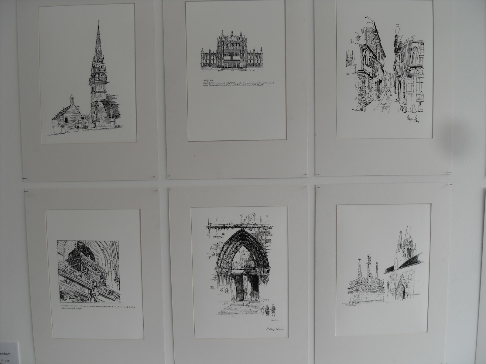
So I will start at the first show I visited which was at UWE in Bristol. It is always worth the trip to go an see this show every year because the range of work exhibited is fascinating for such a small campus. The illustration work especially is stunning which never fails to captivate me. This year was no exception.
First I had a look at the photography which is always of a professional standard but as with most degree shows, there is little in the way of commercial work which I always find strange when you are trying to gain employment after University. We all have our favourite things we like to photograph. Mine is finding rusty metal objects at the coast such as old winches or the rusting metal on boats which take on so many amazing colours. But, I wouldn't use them at a degree show and would rather show a more commercial side to my work which could show a potential employer a different vision and capability. They seem a lot more obsessed with the meaning behind the photographs instead of showing that in the pictures.
The Drawing and Applied Arts section of the show is always stunning. Some of my favourites were Rachel Giddon and her work with wasps nests which are fascinating structures. There was a nice juxtaposition between danger and beauty in her concept and the finished results were very engaging to the viewer. Rachel Harriman had created some 3D sculptures which were formed of images of the human body and then repeated and constructed into multi faceted balls which showed the human form in different ways.


Another great body of work was by Georgina White who had also managed to make some fantastic paper models of her illustrations which made her place in the show look brilliant.


These were just a small selection of some of the amazing work. Following is a few more of my favourites on the day:


Around the corner for the Illustration rooms was Multidisciplinary Printmaking MA. I had never seen this course exhibiting before but was again amazed by how interesting the work was. Everyone on the course has their own specialism that they chose to expand upon whether it be linocut printing, ceramics etc and then they developed their existing skills into a fuller understanding of the discipline. Some of the work was very well executed, especially when you considered the mediums used such as metal and ceramics. Again a few more examples shown below:


Other parts of the show were Fashion and Animation which I tend to quickly have a look at as I haven't got a strong enough interest in but it's always worth a quick visit.
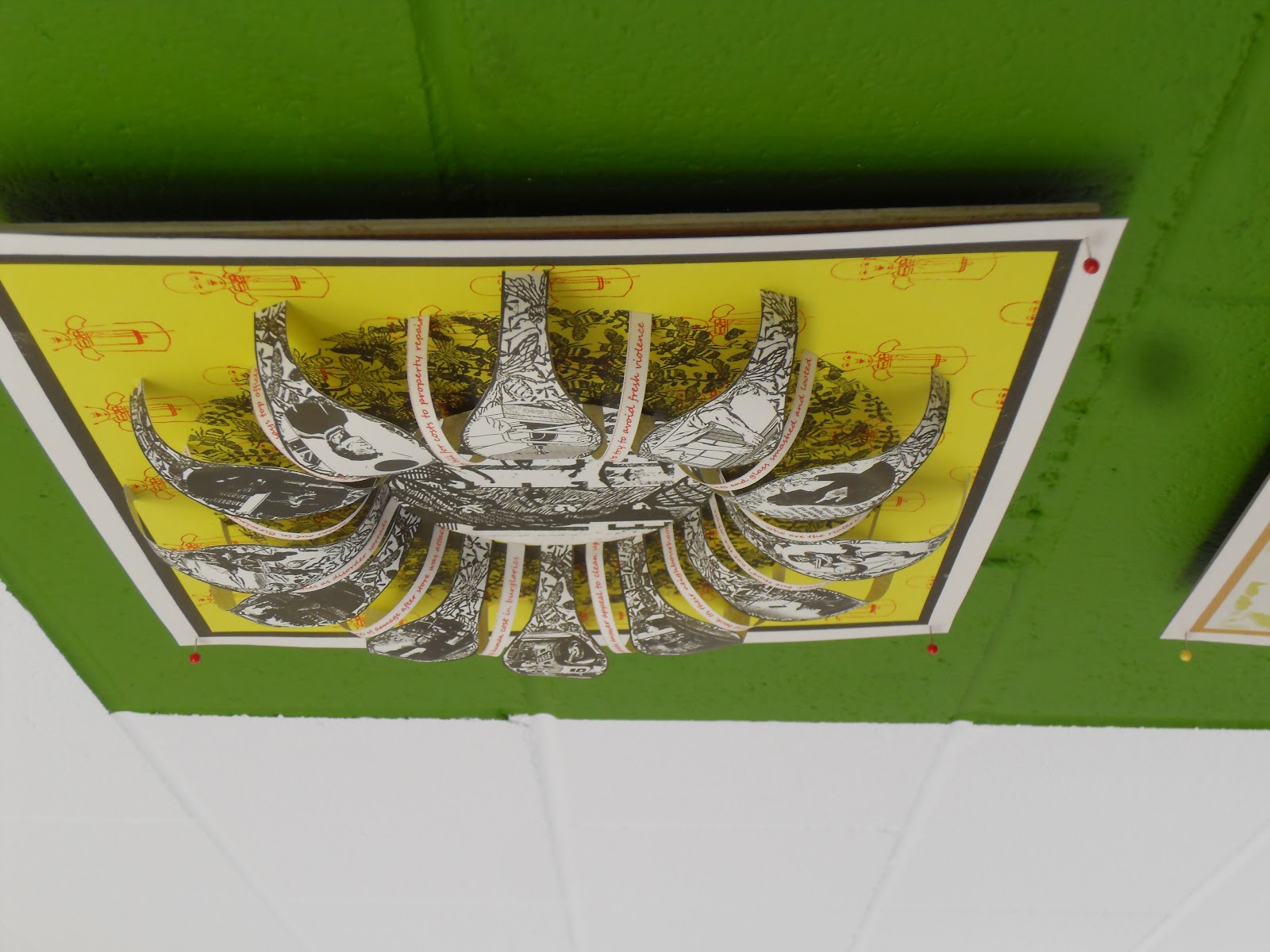
Graphic Design at Bristol has always been a lot different to other degree shows because there has always been a strong leaning towards producing just posters and books. It always seems a weird part of the show to look around as it doesn't strike you as immediately engaging at first but the typography skills are some of the most proficient you will see from students. The posters tend to be very type based and there is always some great infographic work displayed. The books on display vary from professionally produced to a lot of amazing handmade varieties. I think its because there is little variety between the work that some of it gets a bit lost sometimes.


 The pictures above are of some beautifully made pieces which examine how words are still recognisable when you leave certain letters out, namely vowels. Now this has been done loads of times and even though they were expertly made, it sort of took the shine off them a bit using an old idea.
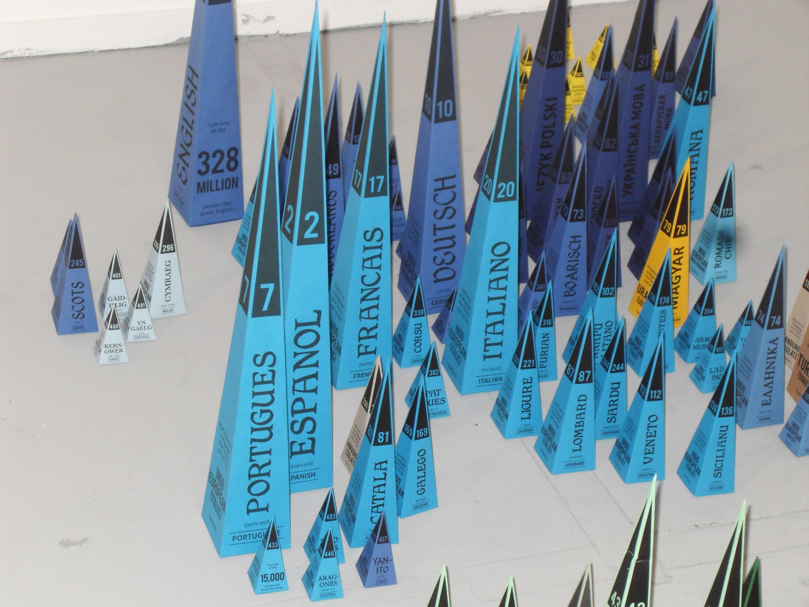
My favourite piece was a rare 3D representative model to illustrate all the different spoken languages around the world. This is what excites me about some graphic design how it instantly can engage you with a simple but great initial idea. Dependent on how many speak that language, the size of the triangle increases so you instantly get a sense of the information. The colours used signify what family of languages that they all belong to and I also liked the considered application of type on each piece.


Following is some general pictures of other work in the exhibition:


I spent over three hours at UWE and enjoyed every minute of it. It has become one of the highlights of the degree show period for me as I always look forward to seeing the great work produced.
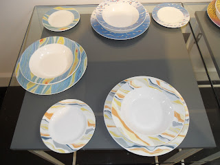
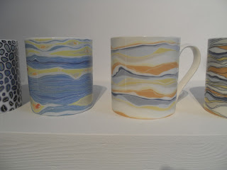
On the way back I try and visit the show at Bath which is on a smaller scale but there is always a few nuggets of great work in their show. As I walked into the main room off reception I spotted some great ceramic work which if I am honest, has given me some ideas for some of my own coastal dreams work.


As my camera was starting to lose the will to live due to a depleted battery, I couldn't take as many pictures as I wanted to but still managed to pick a few well chosen favourites. From the main room you find yourself in the Fine Art section which I always like to look at, not that I understand it all the time but the work is always challenging and has a certain aesthetic appeal. The problem with Fine Art as opposed to Graphics is that the meaning behind the pieces are hidden. What I mean by that is, if you didn't have a descriptive piece of text telling you about the piece of art and the meaning behind it, you would never guess it yourself. Where as with Graphic Design, it communicates the message a lot clearer. So, sometimes you come away feeling a bit confused and somehow cheated that you haven't fully understood what the artist is trying to convey and also less intelligent.


Another strange quirk of the building itself is trying to find your way around. I always get lost easily as the wayfinding system they put in place is always very confusing or is it because I fail to understand it! The Graphic Design part of the show was a bit disappointing as most of the work was in their folders awaiting marking so it was difficult to have a look at most of it. The work that was on show was covered by an assortment of boards which didn't seem to have a purpose at all except to fill up the space. I would much rather have had it less cluttered so you could see the work. The one piece I did like was a piece of packaging that could be adapted into a bird feeder once you had finished the product inside.


The last part of the show I visited was the Textile Design. I was really impressed by the standard of work and how professionally it was displayed. You could easily see some of the pattern designs being used commercially. I didn't take a lot of pictures as most Textile and Pattern designers get a bit touchy about copyrighting their designs which is a bit of a grey area as none of the designs have actually been copyrighted. The few pieces I managed to get pictures of were made with cut up sheets of modelling foam that you can buy from any craft and art shop. They must have taken ages to make and they are not very practical but they looked brilliant.


So, overall it was worth the visit again and will look forward to visiting again next year.
As I said at the beginning, not all degree shows live up to the hype. Last year it was Derby that I was disappointed with. Whilst some of the show was good such as the Textiles, the Graphic Design on show wasn't. The main problem was the amount of spelling mistakes and the terrible typography. I suppose it annoys me because at Staffordshire University, I was lucky to be on a course that drummed in to you the importance of the finished product. To always check it for any spelling mistakes and to pay attention to kerning your type properly. So when I see a supposed finished piece with lots of mistakes, it really gets to me. It should be the students responsibility at the end of the day but didn't any of the tutors inspect the work on show?
So that was last year and this year I visited the show at Birmingham University again. As with Bristol, the Illustration work is outstanding and it didn't disappoint again this year. What did was the Graphic Design part of the show. I was shocked how poor some of the finished artworks were. Not only spelling mistakes and bad typography but when photography was used it was either very poorly cut out or out of focus and badly pixelated. Plus some of the mounting of the work was disgusting. How is someone going to get a job when they can't even be bothered to mount their work properly. It just showed a complete lack of respect in their own work. Unfortunately whilst I was looking at one piece of work, the student whose work it was approached me and asked me what I thought. Now there are always two ways of dealing with these situations. Lie or tell the truth. On this occasion I asked him if he wanted me to be honest. Overall I pointed out over 20 mistakes with his work. Now I am not big headed enough to criticise someone on their ideas and their technical ability because I am still not a professional designer myself, but they were all really obvious mistakes to do with spelling, kerning, print quality and how it was mounted. He also showed me his portfolio which was also poorly presented in plastic sleeves which had been used several times and looked really tatty. Plus the printing itself wasn't very good.
The only benefit to me is that with portfolios of that standard, it helps me gain more placements with mine. This may sound harsh but placements are becoming harder to get and its all about survival of the fittest unfortunately. Ultimately, going to these degree shows gives me a chance to scope out the competition and see how they present their work and see if I can make any improvements to my own portfolio of work. So far, with a few more improvements and a few more pieces of packaging work partnered with a few carefully considered examples of branding, I should be in a good position to gain more placements or ultimately a job.
So I will start at the first show I visited which was at UWE in Bristol. It is always worth the trip to go an see this show every year because the range of work exhibited is fascinating for such a small campus. The illustration work especially is stunning which never fails to captivate me. This year was no exception.
First I had a look at the photography which is always of a professional standard but as with most degree shows, there is little in the way of commercial work which I always find strange when you are trying to gain employment after University. We all have our favourite things we like to photograph. Mine is finding rusty metal objects at the coast such as old winches or the rusting metal on boats which take on so many amazing colours. But, I wouldn't use them at a degree show and would rather show a more commercial side to my work which could show a potential employer a different vision and capability. They seem a lot more obsessed with the meaning behind the photographs instead of showing that in the pictures.
The Drawing and Applied Arts section of the show is always stunning. Some of my favourites were Rachel Giddon and her work with wasps nests which are fascinating structures. There was a nice juxtaposition between danger and beauty in her concept and the finished results were very engaging to the viewer. Rachel Harriman had created some 3D sculptures which were formed of images of the human body and then repeated and constructed into multi faceted balls which showed the human form in different ways.


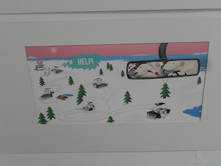
Rebecca Furness examined the changing and evolving landscape of the polar regions and how the polar bears are struggling to survive with the ice literally disappearing beneath them. One of her pieces was a sculptured piece showing lots of small polar bear models squashed together on a disappearing iceberg. This was another thought provoking piece which I really liked.

Overall, plenty of thought provoking artwork accompanied by a well produced booklet which is always nice to have so you can reference the artists to watch their progress.
The part I had been waiting for was next, the Illustration exhibits. As I have said before the standard is amazingly high and the look of the show generally is always brilliant.
I have chosen a few favourites first to show which for me, show a fantastic talent when it comes to illustration. The best for me was by Jesse Hodgson. As a children's book illustrator, her pictures are staggeringly amazing. The detail and colours used draw you in to the pictures and would love to get a copy of this book entitled 'Pongo". The pictures I had taken do not do the them justice and neither do the ones off her website as the colours on the originals are fantastic. I found a few of the development pictures for the story as well as the finished examples.


The next is Laura Lane and her story about a shark. Whilst it is a different style of illustration, the pictures show the story perfectly and are equally as engaging as the story.


These were just a small selection of some of the amazing work. Following is a few more of my favourites on the day:


Around the corner for the Illustration rooms was Multidisciplinary Printmaking MA. I had never seen this course exhibiting before but was again amazed by how interesting the work was. Everyone on the course has their own specialism that they chose to expand upon whether it be linocut printing, ceramics etc and then they developed their existing skills into a fuller understanding of the discipline. Some of the work was very well executed, especially when you considered the mediums used such as metal and ceramics. Again a few more examples shown below:


Other parts of the show were Fashion and Animation which I tend to quickly have a look at as I haven't got a strong enough interest in but it's always worth a quick visit.
Graphic Design at Bristol has always been a lot different to other degree shows because there has always been a strong leaning towards producing just posters and books. It always seems a weird part of the show to look around as it doesn't strike you as immediately engaging at first but the typography skills are some of the most proficient you will see from students. The posters tend to be very type based and there is always some great infographic work displayed. The books on display vary from professionally produced to a lot of amazing handmade varieties. I think its because there is little variety between the work that some of it gets a bit lost sometimes.


My favourite piece was a rare 3D representative model to illustrate all the different spoken languages around the world. This is what excites me about some graphic design how it instantly can engage you with a simple but great initial idea. Dependent on how many speak that language, the size of the triangle increases so you instantly get a sense of the information. The colours used signify what family of languages that they all belong to and I also liked the considered application of type on each piece.


Following is some general pictures of other work in the exhibition:


I spent over three hours at UWE and enjoyed every minute of it. It has become one of the highlights of the degree show period for me as I always look forward to seeing the great work produced.
On the way back I try and visit the show at Bath which is on a smaller scale but there is always a few nuggets of great work in their show. As I walked into the main room off reception I spotted some great ceramic work which if I am honest, has given me some ideas for some of my own coastal dreams work.


As my camera was starting to lose the will to live due to a depleted battery, I couldn't take as many pictures as I wanted to but still managed to pick a few well chosen favourites. From the main room you find yourself in the Fine Art section which I always like to look at, not that I understand it all the time but the work is always challenging and has a certain aesthetic appeal. The problem with Fine Art as opposed to Graphics is that the meaning behind the pieces are hidden. What I mean by that is, if you didn't have a descriptive piece of text telling you about the piece of art and the meaning behind it, you would never guess it yourself. Where as with Graphic Design, it communicates the message a lot clearer. So, sometimes you come away feeling a bit confused and somehow cheated that you haven't fully understood what the artist is trying to convey and also less intelligent.


Another strange quirk of the building itself is trying to find your way around. I always get lost easily as the wayfinding system they put in place is always very confusing or is it because I fail to understand it! The Graphic Design part of the show was a bit disappointing as most of the work was in their folders awaiting marking so it was difficult to have a look at most of it. The work that was on show was covered by an assortment of boards which didn't seem to have a purpose at all except to fill up the space. I would much rather have had it less cluttered so you could see the work. The one piece I did like was a piece of packaging that could be adapted into a bird feeder once you had finished the product inside.


The last part of the show I visited was the Textile Design. I was really impressed by the standard of work and how professionally it was displayed. You could easily see some of the pattern designs being used commercially. I didn't take a lot of pictures as most Textile and Pattern designers get a bit touchy about copyrighting their designs which is a bit of a grey area as none of the designs have actually been copyrighted. The few pieces I managed to get pictures of were made with cut up sheets of modelling foam that you can buy from any craft and art shop. They must have taken ages to make and they are not very practical but they looked brilliant.


So, overall it was worth the visit again and will look forward to visiting again next year.
As I said at the beginning, not all degree shows live up to the hype. Last year it was Derby that I was disappointed with. Whilst some of the show was good such as the Textiles, the Graphic Design on show wasn't. The main problem was the amount of spelling mistakes and the terrible typography. I suppose it annoys me because at Staffordshire University, I was lucky to be on a course that drummed in to you the importance of the finished product. To always check it for any spelling mistakes and to pay attention to kerning your type properly. So when I see a supposed finished piece with lots of mistakes, it really gets to me. It should be the students responsibility at the end of the day but didn't any of the tutors inspect the work on show?
So that was last year and this year I visited the show at Birmingham University again. As with Bristol, the Illustration work is outstanding and it didn't disappoint again this year. What did was the Graphic Design part of the show. I was shocked how poor some of the finished artworks were. Not only spelling mistakes and bad typography but when photography was used it was either very poorly cut out or out of focus and badly pixelated. Plus some of the mounting of the work was disgusting. How is someone going to get a job when they can't even be bothered to mount their work properly. It just showed a complete lack of respect in their own work. Unfortunately whilst I was looking at one piece of work, the student whose work it was approached me and asked me what I thought. Now there are always two ways of dealing with these situations. Lie or tell the truth. On this occasion I asked him if he wanted me to be honest. Overall I pointed out over 20 mistakes with his work. Now I am not big headed enough to criticise someone on their ideas and their technical ability because I am still not a professional designer myself, but they were all really obvious mistakes to do with spelling, kerning, print quality and how it was mounted. He also showed me his portfolio which was also poorly presented in plastic sleeves which had been used several times and looked really tatty. Plus the printing itself wasn't very good.
The only benefit to me is that with portfolios of that standard, it helps me gain more placements with mine. This may sound harsh but placements are becoming harder to get and its all about survival of the fittest unfortunately. Ultimately, going to these degree shows gives me a chance to scope out the competition and see how they present their work and see if I can make any improvements to my own portfolio of work. So far, with a few more improvements and a few more pieces of packaging work partnered with a few carefully considered examples of branding, I should be in a good position to gain more placements or ultimately a job.
Subscribe to:
Posts (Atom)