On Saturday ready for day two. Because my train arrived quite early I had the option on watching Ken Garland or taking part in a Calligraphy workshop. having listened to Ken's talk online, no offense meant but I made the right choice.
With Andreas Frohloff, about twenty of us were taken through the basics of calligraphy. First there was a short presentation about the different nibs and inks used which I found really interesting. Then we had a selection of nibs to try and write with along with some sheets to help us form the letters correctly. I had done calligraphy before but wanted to learn how to form the letters properly again as I think you do get lazy after a while and forget how disciplined the craft can be.
This was very enjoyable and made a welcome change from listening to lectures all day. Not that I hadn't enjoyed the previous day but it made for a welcome change and also a challenge.
By the time I had finished I didn't want to interrupt the talk already going on so decided to take an extended lunch. Luckily, over the road there was the Bloomsbury Festival going on which was a fantastic event with craft stalls, food and drink and lots of arts and crafts events. Plus, the best of all was discovering a fantastic Italian cafe which has always been there but i must have walked past this park over a hundred times and never realised. Not only was the coffee to die for but they make their own pastries which looked amazing and I got tempted by a cannoli for a pudding which I would have after my fantastic vegetarian rizzini, which are fried rice balls with a cheesy mushroom centre to them. I was in heaven!
In retrospect, I should have stopped there because the afternoon was something of a disappointment. First up was Kirsty Carter and Emma Thomas who proceeded to laugh like a couple of naughty schoolgirls all the way through their presentation. It was slightly amusing at first but at one point I nearly walked out. If you know you are doing a professional presentation in front of a few hundred people, at least practise it first. Not amused.
The next speaker, Patrick Cox was someone I wanted to hear as I admire his much talked about work for the London 2012 Olympics and Paralympics. Personally I really liked the new logo as it wasn't so country generic and was a brave solution. What made me laugh was the backlash of supposed better logos for the games which on the whole were all shit. It just showed how little they understood. Nearly every one of them had the Union Jack, London Eye, River Thames, Tower Bridge etc , on them. Having been lucky enough to be at the Olympics and see all the signage in place, in reality it looked amazing. Especially the tickets themselves which I am starting to collect off Ebay as not just reminders but also as design icons.
After a much needed coffee because I was starting to feel my eyes going. Again, hint to self, stop over next time. Next was Grant McCracken whose talk was entitled, Design As A Respiratory Event.
His talk was very interesting but was difficult to follow. As a cultural anthropologist and an academic, I found it hard going but instantly I was interested in his presentation style which involved him constantly pacing up and down the stage. It made him more engaging for some reason and you wanted to listen more intently. Basically it was about every different culture around the world has its own sense of order and a sense of place. We all have our own sense of what is normal.
It was also interesting about the structures of companies and their hierarchy. They stick to a regimented pattern and working life but nowadays the world doesn't operate like this anymore. Like I said previously, it was difficult to follow but one term I liked was encountering a 'black swan'.
Basically this is something that comes out of left field and supersedes something. Sort of like flat screen televisions taking over the previous CRT models. His own example was of an American University who had students attending and paying to study a maths course. But, the students realised that the same course was available online for a fraction of the cost and they didn't have to pay the high fees of the University but still get the same qualification. So, the University didn't see this 'black swan' which has resulted in wiping thousands of their funds.
Luckily the presentation is online so I will watch it again because I am still curious.
Luckily to wake me up a bit was Joshua Davis. Again, someone who I had never heard of but he sure kept me awake and on the edge of my seat for the next hour. Full of confidence and energy that I have to admit I was fascinated and was one of those rare moments when you see or meet someone, that changes the way you think and give you a fresh perspective or outlook.
His core work is developing self sustaining patterns from code which in turn are published as stand alone art or used as patterns for skateboards or bags etc. It sounds quite basic until you see just how fantastic the patterns are. You realise that to design one from scratch using vectors would be almost impossible due to the delicate intricate nature of them.
His enthusiasm is great to see and his willingness to make mistakes and experiment all the time is really an inspiration. I have met a few seasoned design professionals in the past who are either living off past glories or really do believe the hype that they are God's answer to Graphic Design. In a way that we should put them on a pedestal and revere and worship them. Sorry, but no!
Now I am not going to be foolish enough to name names but there are quite a few younger designers as well who have ego's the size of a planet. I think part of it stems from the social networks where you can now readily show your work and have it drooled over by fanatical students who want to be just like their idols. This whole artist and designer worshipping really annoys me. Like everyone else I have a few designers that I admire, respect and have a genuine love of their work but that's about as far as it goes. Also it's a fear of being ridiculed when you say that you don't understand a piece of design or that you don't see what is so amazing about it. Everyone should have an opinion but not just as an opportunity to rubbish someones credibility for no reason but you have to be able to reason and back up your argument.
Anyway, back to Joshua Davis. So with regards to success and failure, it was refreshing to hear a respected and talented artist being so honest.
At the start he was discussing about the word, 'work' and what it actually meant. But he wanted to actually talk about play but after talking to friends they said it was a bad idea as people hadn't got time to play and only work. But he decided to conduct a brief experiment. When he asked adults they all said that the opposite of work was play. So after posting the same question on facebook and Twitter and asking parents to ask their kids and the results were more interesting. The kids said words like Lazy, home and boring. The reason was that if kids are not doing anything at all, they are bored.


With regards to play, he visited a friend in Cologne, Germany and visited a Cathedral where there was pattern inspiration everywhere which then gave him loads of ideas to mess about making patterns. Then for some reason when they got back to his home, he had to get something from the basement where he discovered this amazing random tiled floor which gave him some more ideas on playing with more geometric patterns. When he arrived home there was a message from a potential client who wanted ideas for a book cover which suited one of his pattern designs he had been working on and so a nice piece of client work was born out of just playing.
He is basically a kid that hasn't grown up which is probably why his personality is infectious. In the late 80's he used to be a sponsored skateboarder and he even has a half pipe built in his back yard.
His one idea was about play and his idea for a social grid which was about being able to adapt one or several of his grid patterns that you could manipulate in any way that you wanted. So some of the designs that had been sent in were shown which were sort of simplistic whilst others were quite predictable. But like he says, it's all about the play and it doesn't always have to be perfect as you might get an idea from it or you might not but its all about playing with concepts and ideas.


Then he went on to talk about a more analogue approach to working and getting away from the computer. It's always good to go back to designing by hand and not having to worry about layers all the time. Its a scary process because once you have committed to putting a mark on paper, its there for good but this can be quite a liberating experience. On the next pictures it shows some of his hand drawn experiments which were first looked at on screen, printed out and then developed by using marker pens. This turned out some great designs that could be used on skateboards so again he copied by hand the patterns directly on to the board which gave a great organic look and feel. So just from messing about again he ends up with a solid project.
FAILURE IS PART OF THE PROCESS. Every day you should worry about what you are doing. You don't know everything and the secret is to collaborate with others so you can pick each others brains.
One comment that I really enjoyed was..................
This sort of resonated with me and make me really think about what I want to do. I have been sort of going though a crisis the last few months and worrying what I am going to do which is still ongoing but this really blew my mind a bit if I am honest and really got me thinking.
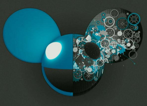
Anyway I could go on and on about his work but it's easier to show some more pictures and leave it at that. So there are a few more pieces of his generated artwork plus how some of them ended up on some really cool headphones for Deadmou5 and how before the proper launch date, a famous athlete walked into the Olympics and promoted them without realising he had done the job for them!
I have so got to get a pair of those cans...................
The final presentation of the day was by Irma Boom. A book designer of great distinction who you will not be surprised to know, I have never heard of her or her work before. Book design is something that doesn't really interest me a great deal but I can obviously appreciate the care and thought that goes in to some publications.
I only managed to see about twenty minutes of the talk as I had to leave to catch the train back home but again, I will watch the full video online. Her presentation style was quite difficult to stay motivated as she admitted she never looks at the audience when talking and just stayed sat behind a projector randomly flicking through some of her books. Especially at the end of a long day, you look forward to someone a little more inspirational. I could tell from looking at the audience that a few were entranced by her talk and were fans of her work but if I am honest, I don't think I would have liked to sit through to the end anyway.
Just to conclude, I thoroughly enjoyed the two days and would definitely go again next year if it came to London again. From a cost perspective, it makes it more worthwhile travelling down to London to see over a dozen talks instead of just the one which I have done on the past. D&AD hold some great events but it's a bit much travelling all that way and back for a one hour lecture sometimes, even though I have seen some great inspirational speakers such as Paula Scher, Wayne Hemmingway, Neville Brody, Bob Gill, Sir Alan Parker, Harry Pearce and so on and so on. Its always interesting as well to see different presenting styles as I am trying to change the way that I present work as well. Some are good but there also some that fail but you can always take something away with you. Ultimately, you go to these events to be inspired and feel regenerated which has proved to be true for me. I have a head full of fresh new ideas, ways of working and things that I want to try in the near future. Especially being stuck still at a professional and creative crossroads, it has helped firm up a few ideas on what I want and need to achieve for the next few months.