I have been looking through a few choice books today mainly for inspiration and whilst reading one about Logo Design, wondered how many new logos I could make out of a couple of iconic designs. Answers right at the bottom:
There are probably countless other designs you could come up with but it would depend on how many you would actually use for something else.
Anyway the top two are Atari and the bottom two are Adidas.
I have said previously that I love taking photographs of decaying objects. Especially if its at the seaside where you can find amazing colours in peeling paint on old fishing boats or a multitude of colours found in rusting boat winches or on groynes. There is just something unique in the way that objects decay over time and they all take on their own sense of degraded appearance whilst retaining a kind of beauty.
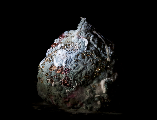
The following photographs are not coastal based, which makes a change, but equally fascinating. Estonian artist, Heikki Leis, first noticed it in some potatoes he had left in a pot for too long and on closer inspection, he saw the amazing forms and colours starting to appear that he started photographing and publishing them online, to see if anyone else found them as fascinating.
It started to attract several micro biologists who are studying how food degrades and they encouraged further study in this area.
There is something about a well designed logo that cannot be beat. You have your classics like Fedex and Nike which are simple but eye catching and now you have your icons for things like Facebook, Twitter etc which can also been seen as a logo of sorts.
Time magazine detailed the new branding for the Minnesota Zoo back in the early 80's and I loved its simple accessible design. It had a great childlike quality and looked like something straight out of Sesame Street. I found some of the original pictures the other day on a Logo website which examined the original rebrand compared with how it looks today.
It looks perfect for a zoo and is really engaging. Compare those above to the current identity:
I wish they had just revamped the old design as the new one is just trying to be too clever. The old design was a lot more iconic and didn't need any other words to give the zoo its identity. I loved the old wayfinding icons as well which were fun but easily distinctive. The problem today is that in an increasingly competitive market, companies are becoming obsessed with rebranding themselves every few years. There is an old saying, its a bit of a cliche but its true. If it ain't broke, don't fix it.
I was in the Jewellery Quarter in Birmingham this morning to catch up with an old friend who I haven't seen for too long. She makes the most fantastic pieces of exclusive jewellery that I am always in awe of her work. Sitting in her studio with some soothing background music on, a lovely cup of coffee, watching her work got me thinking.
Sometimes when I am creating designs or pieces of my paper crafts, they have got to be some of the best times I have ever spent. Because you are concentrating so much on every little detail and getting excited about how the finished piece will look that I realised in some small way, that is what is missing in this country and something that a lot of school leavers will never experience. The joy of making.
We used to be a giant of manufacturing, respected the world over and now we have been reduced to a nation of service industries. There is something special about taking something and turning it into a physical product that you can touch and feel. I count myself extremely fortunate because when I left school I went into engineering. One of my first jobs was working in a small backstreet engineering factory in Birmingham making parts for guns. It was highly skilled work and you attained a great sense of achievement making something perfect that would be used on an expensive product. Then I worked at several more small companies, learning from men close to retirement who would get out their mahogany tool chests full of amazing hand tools and measuring devices. Nothing comes close to getting on your overalls, first brew of the day in hand, firing up the machinery and wondering what you were going to create that day. The smell of the suds and the bright sparks that escaped off the metal at the first touch of a cutting tool just cannot be beat.
Another job I had was making spray booths for the car industry. You would get your drawings from the offices and then have to design how to make it yourself. Just the thrill of taking several sheets of flat metal and turning it into a 30ft spray booth over a couple of weeks was great. You had to make all the ducting by hand, work out where the wiring was going, where to put structural pieces in to make it secure but not too heavy and then have to travel to site to erect it in place. The factory had proper apprenticeships where you would see clueless teenagers turn up one week and in a few months it was fascinating to see their skills improve. Not just from an engineering perspective but it made them more sociable, especially when you had to work with people of all ages. Basically it made you grow up!
It may be a generalisation and I don't want to get all political but I think that's why so many people are unhappy in their daily lives. There is no sense of achievement sometimes.
The last time I was in London and you walk past these vast office buildings filled with suits, grey filing cabinets, headache inducing strip lights and I feel sorry for them almost. I've done the corporate world and there is no way I am rushing back to it. The money was great but you never got a sense of achievement. Now I know we need people to do these jobs or the country would grind to a halt but at least we could make the work environment a lot more interesting.
What we need is the people who design their own design agency spaces to go into drab office spaces and change them. I know you can't change the building itself into some trendy loft space or converted mill but you could change the inner shell to something more exciting and vibrant. As a nation we love decorating our own homes and choosing bold printed wallpapers, modern kitchens, colour everywhere and then where we spend nearly a third of our time, is grey and depressing.
So if the government is going to try and get Britain's youth into work, please don't shove them into soulless office spaces, create some small manufacturing units and get them making something for the nation. Not just creating jobs but creating products to increase sales that creates more vacancies that creates more youngsters brimming with pride at making a genuine contribution.
Ditch the suit, get your hands dirty and make something!
The cider market has been growing stronger over the last few years due to its constant rebranding as a more mainstream drink. I can remember drinking scrumpy at the local pub years ago and it tasted fantastic but you knew about it the next morning with your stomach feeling like it was in knots.
It was also the containers it was sold in which looked like jugs, which didn't really give it a mass appeal and used to be bought as a holiday present which would then sit in the cupboard for years until you fancied risking it one Christmas.
Now we not only have a lot more brands in the market but added flavours, not only pear varieties but adding different fruits to give the cider a distinctive tastier edge. Bulmers Red immediately comes to mind, which I tried a few weeks ago, which has added red berries and lime. Whilst I enjoyed the premium taste, i didn't enjoy the premium price!
Another leading cider manufacturer, Gaymers, is also going through a transformation at the moment. Using the 'Live It Louder' strapline, they have changed their packaging to help revive their poor sales. The design is supposed to attract a younger consumer and trying to be the first choice at music venues and festivals. They have also introduced two new flavours, Pear with Raspberry and Pear with Cherry.
To help with the marketing, there is going to be a series of campaigns tied to music festivals such as Latitude, Bestival and Lovebox.
Most of us have seen the new Magners adverts and they have a great sense of humour but they also have a considered packaging design to go with it. The problem with this redesign is that it looks a little too childish to be used on alcohol. The first thing I thought about when I saw the typeface was Willy Wonka chocolate bars. I know there is a slight leaf design interwoven with the type but I do think the design is too childish for a cider brand. I can appreciate that they are trying to capture a younger market but I think they have overstepped the mark with this one. It looks too much like a trendy fruit juice and I personally don't think it is going to help them in the long term. The upscale in sales with only come from the initial launches at festivals which will involve the odd giveaways but after that I cannot see it being able to compete against the other brands.
1. Naming is a creative process. Be prepared to look further than the obvious. You cannot own the obvious.
2. Don’t expect to find the name in a brainstorm session. You might, but I doubt it. Seriously, your time is valuable, don’t waste it. And you need plenty of time to do this right. Just because somebody tells you that it will be fun to get together and be creative, doesn’t mean that you will actually be creative. What you will discover are that most of the words could have been found, by you, without leaving your desk.
3. Have faith. Trust your namer, namist, name generator, namologist; word rider (or whatever they call themselves today) to do their job. Let them go away and rootle around and dig and have all of the disappointment for you. They do that so that you don’t have to. You don’t need to know what they’re doing. If it was easy, you would have done it yourself.
4. Forget your hysteria about owning a “.com”. Your brand name and your domain name do not have to be identical. No, they don’t. Please don’t give up on a fantastic trade-markable name just because someone else owns the domain. Think laterally. Be flexible.
5. Be prepared to think differently. The answer to your problem may be quite challenging. Be prepared to be challenged.
6. Listen carefully. Listen again. That’s the only way you’re going to hear the magic. Please pay attention, I said, “Magic”.
7. The biggest barrier to a great name? You. You and your personal taste. Objectivity in naming is the hardest thing to achieve and this makes naming not just problematic but downright frustrating. Don’t ignore the criteria that you set out with, they may help you to see more clearly.
8. Finally, give yourself time to succeed. You cannot hope to produce a golden piece of intellectual property in a few days, or over night, so don’t believe anyone who tells you that they can.
Naming is tough, very much like a game of ‘Snakes and Ladders’ but, as long as you understand that at the start you won’t be disappointed.
I remember going to a business club a few years ago which catered for new startup businesses and gave them some useful advice on how to start a business. As well as the usual information on how to keep records and accounts, there was also a part about getting your company stationery printed. It was commonplace to order your letterheads, business cards, compliment slips and the dreaded triplicate invoice book.
The reason I mention this, is I was reading an article in the Drum magazine a couple of weeks ago and apparently the stationery market has reduced by half in the last five years. In one way I can see how a lot of business information is sent via the internet using email, social media etc, but I don't know of one company that doesn't still use some sort of headed paper to send out the occasional information.
What has also changed is that you don't tend to bulk order your company stationery like you used to years ago because there are so many printers available today who can get them printed in 24 hours anyway. Plus if you want to change any information such as addresses and phone numbers, you don't want to have reams of paper lying around redundant.
I can also remember giving a lecture about the exciting prospect of the paperless office. No more filing cabinets filled with expandable files because we can now store everything on hard drives or even in a few years we will be able to use online storage. So while we now send invoices and bills via email, how many of these are still printed out onto paper and filed away? It has made little difference to be honest.
The vast majority of us still don't quite trust having a digital copy of something and prefer to have something tangible in our hand instead.
Personally, I like having a letterhead and business card to hand out as it communicates something about your company. The quality of the stock used and the look and feel all help to create a sense of reliability and trust in you as a company and as an individual.
When you take a look at Arjowiggins, the paper manufacturer who is well known for its Conqueror range of papers, they are still managing to return profits in the millions every year.
Also, inevitably, you have to address the issue of recycling. I wasn't aware that you cannot recycle paper completely without having to add some virgin fibre into the mix. So the time will have to come when we have to cut back on our paper consumption and something like an unnecessary letterhead will be one of the first to disappear into history just like newspapers and magazines will eventually.
We all know how a good breakfast can set you up for the day but can you get that in a drink to replace that important bowl of cereal?
Pearlfisher have just rebranded Oat Works, a new drink from Wellness Works. It is a series of oat based drinks that claims to provide a consumer with a nutritious and wholesome meal replacement that can be consumed on the go. The magic ingredient is something called PromOat, a natural ingredient from Sweden that enables the benefit of oats to be incorporated into liquid form. The other claims are that it is perfect for a healthy heart, a healthy digestive system and sustained energy.
With regards to the design, the vibrant colours help to enforce the vibrant ingredients and tastes. The beige background is there to highlight the core benefits of the oats.
Whilst i like the design and it is an intriguing product, I am a bit disheartened to see yet another breakfast product to be consumed on the move. We lead such busy lives as it is and if you haven't got time to sit down and have a proper breakfast, then quite frankly, you need to get out of bed a bit earlier!
There are far too many fast food items being released on to the market at the moment. Can someone please explain to me why we now need frozen baked potatoes for instance? You can see the future of food being little pills that contain all the right nutrients for the day and being able to tailor the ingredients to benefit the individuals health requirements. Food and drink shouldn't just be something we just consume to get the nutrients from, it should be a feast for the eyes if nothing else.
I can see this product selling well in the short term to the younger age groups as they can find any excuse to skip breakfast at home, even though they stuff there faces full of chocolate and crisps on the way to school. Ultimately, for me, it's just another product that I like the packaging design but not the product itself.
My favourite brewery in Southwold, Adnams has produced yet another award winning beer called Ghost Ship. Not only do they have some of my favourite brand identities but I like the full range of their beers which is quite rare these days. They have such an attention to detail not only to the end result but also to their carbon footprint with radical production methods and recyclable materials used.
My reason for posting this is they have been travelling around Norfolk and Suffolk promoting Ghost Ship by showing a projected film to promote the new beer. Basically showing up at interesting buildings at night, opening the van doors and projecting the short promotional film. I am biased but I like it!
I was sorting out some of Sophie's books the other day and there is a common thread between most of them, why we bought them for her in the first place. Not only are the stories brilliant but it was because of the amazing illustrations. I have always been slightly envious of true artists who can draw or paint lifelike pictures that create an engaging scene. The level of detail in some of them is staggering. One set of books that we all like reading has to be the Winnie The Witch series by Valerie Thomas and Korky Paul.
Valerie is the author, who was born and lives in Australia. She used to be a teacher and her passion is travelling to most parts of the world. For a writer, this must give some amazing experiences that can feed into your writing and give your work a greater depth. Korky was born in Zimbabwe where he admits he had a privileged childhood. He studied Fine Arts and Film Animation before starting his career in advertising. As an illustrator he has won countless awards and has sold more than two million books in over twenty languages.
What I like is the attention to detail in his pictures which never fail to engage as you see something different every time. I would love to know how long it takes him to illustrate every piece with regards to making a living. For any book with possibly eight to ten illustrations needed, you probably get a flat fee for each picture and with this much attention to detail, must make it difficult to make it worthwhile. But the benefit is that you get some amazing books that you never tire of reading to your children.
The next favourite of mine is Lynne Chapman. She has been illustrating children's books for many years but started out as a printed textile designer before moving on to being an editorial illustrator. She worked on most of the major newspapers, magazines and some trade publications as well. She has been quoted as saying that she prefers to illustrate children's books because she has more time to immerse herself in the story instead of having to quickly churn out pictures for magazines and newspapers.
Like most illustrators, she has her own individual style and way of working. Her medium of choice is soft chalk pastels onto textured paper which gives the look she needs. Lately she has been illustrating with pen and ink before scanning into the computer to add the colours digitally. The obvious benefit is being able to correct any mistakes a lot easier.
Not only are her book illustrations lovely to admire but she also travels a lot and keeps a sketchbook of her travels which is equally engaging to view.
Also a few pictures of her vast portfolio of pictures:
Finally the lady herself:
Another of my favourite illustrators is Michael Foreman. Some of his pictures are beautiful and are works of art in their own right. Some of them even seem too good to be in a children's book but that is the beauty of children's illustrated books because the standard is so high.
He was born in Suffolk, studied at the Royal College of Art and also in the USA. In the late 60's he lectured at St Martins School Of Art and also went on to work at the Royal College and the London School of Printing.
He hasn't always been a children's illustrator and in fact has illustrated some well known books by Charles Dickens, Oscar Wilde, Roald Dahl and Rudyard Kipling. As well as designing Christmas stamps and providing work for countless European and American magazines.
What I admire about his work is his ability to capture your imagination and convey the right emotion to tie with the story. Having studied art he has the ability to paint and draw from life using the correct senses of anatomy and perspective.
His breadth of work is staggering but here is a few of my favourites:
There are always going to be certain books that will never be thrown away and Peepo by Janet and Allan Ahlberg is one of them. It is such an engaging book with some fantastic illustrations that you never tire of reading or looking at. Alan is the writer whilst his wife Janet is the illustrator. Sadly Janet died of cancer in 1994, aged only 50, a great loss to children's illustration and also sadly to the publishing partnership.
They have produced many other books but this one is my favourite because throughout the book you have a small circle cut out of the following page so you can get a sense of the following picture but when you turn the page the full scene unfolds.
Whilst I could literally go on forever with children's books, I will just show one more.
I have lost count of how many times I have read Percy The Park Keeper and Albert Le Blanc books to Sophie. Not only are the stories brilliant but the illustrations are fantastic for children. Nick Butterworth has illustrated some of the best well known books for children in recent years. Why I left him to last is also his connection to my main interest of Graphic Design. After studying at the Royal Liberty School in Gidea Park he was an apprentice typographical designer with the National Children's Home before working at Crosby Fletcher Forbes which is the beginnings of the design agency pentagram that exists today. He then decided to leave to become a freelance designer, working occasionally with his friend Mick Inkpen who is also a well known illustrator.
His most famous character has to be Percy the Park Keeper who appeals to all ages. His style of writing is engaging and along with his charming illustrations, make for the perfect package.
The beauty of creating a likeable set of characters is the likelihood of being able to write more books within a set location. Also the subject matter is suitable for anyone, regardless of your background or location. Another reason I like them is that they retain a sense of innocence about them. It is said time and time again in the media that children lose their innocence a lot earlier than when I did and that's very sad. I would spend hours going on my bike off on adventures with my friends all over the place but now we seem to have this obsession with having our children always in sight. These books have that sense of adventure about them and enforce that strong bond of friendship and helping one another which is so important to learn when you are growing up.
Mine and Sophie's other favourite is Albert Le Blanc which is not only a great funny story but the illustrations transport you to the wonders of an old fashioned toy shop where there sits a sad looking bear who never seems to smile. The other toys try to make him laugh and it isn't until the end where the bear explains that he is not unhappy but it is just how he was made. Also, lately, a lot of books have CD's inside with the story read by someone famous. This one is read by David Jason and his voices are really good and it has been played to death in the car.
I did say that I could go on all day but this is definitely the last one.....for now anyway!
We're going On A Bear hunt has to be included not only for the great illustrations by Helen Oxenbury but also the story by the great Michael Rosen.
Born in Ipswich, her father being an architect, she developed a passion for drawing at an early age. later she attended the Ipswich School of Art, working in local theatres in the holidays where she would eventually start her career. Starting at the local Rep theatre designing and painting the scenery to then working for ABC Television and at Shepperton Film Studios.
When she met her husband, who is also a children's book illustrator, Helen started a career down the same path which seems like a good choice to me considering her fantastic illustrations.
But like I said earlier, my favourite has to be Bear Hunt which has some great sound effects that you can say together. See if you can recognise the narrator on the video at the end. As a clue, he started on a building site in Germany and then as a detective in Oxford!