This again, was a fascinating lecture but was a bit self indulgent to the point of, well to be honest, it did lose me a bit especially when he started talking about his band that he had created with another two musicians. I am using the term musician quite lightly as the whole project seemed very experimental to the point of not really being music as most people would recognise it.
I always find with these type of projects that it depends on how open minded you are at the time and I started off wishing i could leave for lunch but then found myself being intrigued more and more. The attention to detail on the actual look of the band was quite interesting. Giving them each a signature look and inventing certain characteristics for them was something different and made the idea even more intriguing. Unfortunately I haven't been able to find any images which is a shame.
Tony Chambers from Wallpaper had intrigued everyone as his talk was entitled, 'Getting A Stiffy'. I can imagine everyone was suitably wondering what the talk was going to be about. Apparently the 'stiffy' in question relates to a term for an invitation made out of stiff board.
Because of his links to the fashion industry, he has been lucky enough to get invited to most of the top fashion launch events and so receives an invitation. From a collection of over 5000, he showed us some amazing examples. It was interesting to see how much design and money they spend on them. It's a difficult position for fashion houses because on the one hand they can cost a lot of money to produce but also they have an image to uphold. For me it was great to see them as I have always liked this type of ephemera and can appreciate how much thought and attention to detail has been lavished on them.
The problem arises from the materials that they are using. Some of them were made with plastics and leather which in this day and age sort of leaves a sour taste in the mouth. With so much publicity about using sustainable products, it doesn't always show these companies in an ethical way and sort of tarnishes the industry as a whole I think. The one element that also fascinated me was how they use calligraphers to write the invitations and make them more personable. Now at first i thought this was a gimmick but he showed several by the same company and you could clearly see that they use the same person every time to write them. Plus they never divulge who has designed the actual invitation which I found a bit strange as surely it would be great publicity for the designer involved. The reason is that the fashion companies want you to believe that they have produced them themselves. What a strange world they exist in!
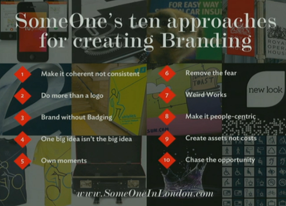
Simon Mandchip from Someone was talking about Branding, Not Blanding. Again someone else I had never come into contact with which makes it all the more interesting and fresh in my opinion.
He is a member of the D&AD executive as well as being an external assessor for Central St Martins. For over twenty years he has been responsible for projects for the Royal Opera house, Maritime Museum and The Royal Observatory.
They specialise in Launches and Relaunches. Brands only exist where there is competition. The idea behind branding and marketing is to engage with the masses and to create a monopoly and above all be liked by people. Its trying to create something that people talk about and spread the word throughout the social networks. People don't just buy, they own the brand. There is so many products out there and lots of choice for most products. Especially when it comes to writing feedback on hotel websites which can so easily affect and harm a brand. He used the example of Gap who wanted to change their logo but the backlash from social media sites and feedback forced a massive company like Gap to stop the changes.
The places where you can advertise now has changed.
Radio - entertain me while i do something dull
TV - Entertain me while I vegetate
Newspapers - Entertain me while I wait for something else
The internet though is a perfect channel for people to comment and complain. It has maybe given too much ownership to the man in the street. Traditional marketing has become stale and because we get bombarded with it everywhere, we are starting to lose interest which is something that they are trying to overcome.
The truth is that socially successful design needs only one thing. Great brands are opinionated, have principles and are divisive. It's impossible to effectively appeal to everyone. It's always difficult sticking to your principles but like John Lewis sticking to their tag line, Never Knowingly Undersold can work.
So instead of showing lots of their branding work which wasn't that interesting if I'm being honest. I could see where they were coming from with the whole logo thing but the branding projects that they did show didn't really engage me if I am honest. The clients were no doubt happy but they sort of come up with a basic idea and then let other people take that idea and adapt it in a myriad of different ways.


To start the evening session was Vaughan Oliver. I would have taken some notes but he insisted on having the auditorium and the stage in almost darkness. A fascinating person to listen to but he didn't seem very at ease on the stage. Mostly known for his amazing work on album sleeves for bands like the Cocteau Twins and The Pixies.
What i admired was his attention to the music and not just the finished design. He liked to meet the bands themselves and immerse himself in the lyrics and the style of music. This was back in the day when you had album sleeves to design and wonderful sleeve notes to read. One of my passions has always been vinyl records and I am always sad that music has been reduced to poor quality digital downloads. We have all been drawn in to the marketing hype that mp3 is the way forward and the quality is amazing. Nothing could be further from the truth.
Anyway enough personal ranting for a moment........What was inspirational was his crossover from art to design and that most of his sleeve designs have a more organic development to them which gives them an original quality.
Erik Kessel's talk was one of the best for me due in part to the humorous stories about some of his ideas and clients. I could quite happily talk about all of them but have picked two of them.
The first was to help an Amsterdam Hotel. The owner wanted some way to stop all the negative comments about the hotel even though, as Erik said, it is a real shit hole! Many others would propose a rebrand and try and make the place look better to encourage more visitors but the solution that they came up with was far better.


Another aspect of his work is a fascination with unusual photographs. As well as compiling books of found and discarded photographs, he came across some true gems and a great snapshot of peoples lives. One of them was a woman who goes to the same fairground on her birthday and shoots a bullseye every time which in turn triggers a camera which preserves the moment forever. She had done this for over 50 years and you can see from the shots her getting gradually older and her changing friends and family around her which is a lovely bit of social comment.


Last of all is one of his latest books which are photographs of the same woman who is always shot standing or floating in water. Her husband has been taking these shots from since they first met. He has a strange fetish about her and water which has resulted in some strange photographs over the years.


After finding the series of photos on Flickr, he contacted the couple to see if he could make a book of them. As a nice touch for them, he had a personal copy just for them printed on waterproof plastic coated pages so that they could still enjoy the book in the water!


The final talk of the day was by Paula Scher from Pentagram. Now i have chosen not to show any of her work or go into detail because I have been an admirer of her work for a few years now not only from her work at Pentagram but also her amazing series of map paintings which I like. I think the reason I like her so much is her diversity of projects that she has been involved with and her honesty about her skills and limitations.
No comments:
Post a Comment