As I had never been before I didn't know what to expect and had only heard of a couple of the speakers. This made it more interesting to be honest as there is nothing worse seeing a repeat performance of a previously seen presentation.
So, the first presenter of the day was Sara De Bondt with her presentation being entitled The Office Of Statistics. Now I don't know if it was because it was too early but I cannot remember anything she said at all. Her presenting style was quite static and monotone to be honest which made it quite hard to concentrate especially when most of the talks were hourly based. So apologies to Sara but I will have to research her studio when i have a bit more time later on.
Next up was Tim Beard from Bibliotheque whose presentation was delivered professionally and was really engaging. I have seen there work previously for DandAD and the Education Network which I really like the type treatments used. What I also like is the pattern design which can easily be adapted for anything from stationery to signage. It is quite simplistic but in some cases it can be over complicated and fail to communicate properly with the real message getting swamped.


As the theme behind the conference was SOCIAL, Tim looked into this theme and tailored his presentation competently. Basically he had leading slides that used the word Social with tagged on description words such as Design, Dialogue, Boundaries, Collaboration etc etc. I enjoyed listening to how they ran the studio especially when it came to sharing work and having a no headphones policy which makes a nice change nowadays.


Next up was Anthony Burrill. He works with various media such as posters, 3D and multi media. Some of his clients include The Economist, The British Library and London underground.
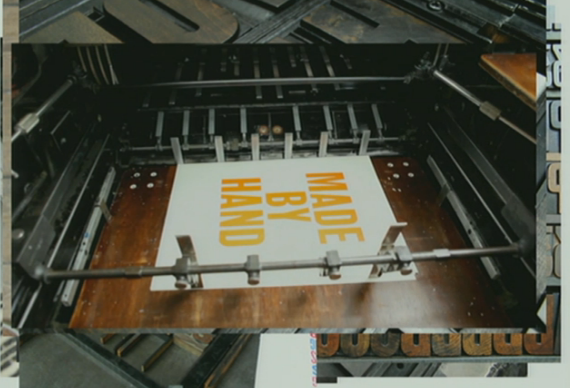
His main specialism is as a printmaker and has produced a plethora of poster designs with simple but striking messages. Some of these include, Work Hard And Be Nice To People and Oil And Water Don't Mix.

As an older designer he has learned from producing artworks using paste ups and photocopiers. Some might say that learning the proper way to produce artwork is invaluable and I would agree. Especially when it comes to typography. When he moved to Rye in Sussex he noticed a lot of posters around the town advertising summer fete's which had a look and feel which he liked and found out that one of the local shops had a big printing shop behind which looks amazing.


His Work Hard And Be Nice To People poster was sold online firstly and after a while he searched for pictures of his poster that other people had taken.


It's great that he still uses traditional printing methods to print out his work and the results will always be a lot better than a digital print as you get a natural quality to them. He has now made some great networks with Los Angeles and Sao Paulo in South America. The second connection was for a project to teach some locals his processes and his own work. Also after having seen a video on You tube about a local printers, he managed to get a workshop organised there and set a brief to print out some sayings devised by the students.


The results are great and it was good to use one of the old printing shops in Sao Paulo as a lot of them don't exist anymore because of a crackdown on fly posters which used to be seen everywhere.
The last poster that I hinted at earlier is Oil And Water Don't Mix and is worth a mention because it was actually printed with a water, oil and sand mix. It was related to the oil spill in the Gulf of Mexico and the idea was to use some of the oily sand from the actual beach. So after a few problems gaining access with the over zealous security there and also trying to get the mixture right to enable the poster to be screen printed, the results look really good.


No comments:
Post a Comment