It's that time again when we have a look at some of my recent favourites.
First up is by one of my favourite studios, Turner Duckworth who I would love to work for and is actually top of my dream list of potential employers. Nothing like aiming big! Anyway it's a redesign for Conte a Paris pencils, charcoals and pastels. They have been around for years and I can remember using them when I was at school, which shows just how old they are. I admire how they have looked at the brands Parisian roots instead of showing illustrations or drawings that you can do with the products. The result is a range of stylish packaging that looks more professional and carries the company heritage better.
Next up we have some great branding for Hawthorne and Wren who sell exclusive gifts. I have chosen this one because you get to see a full range of associated stationery and packaging that carries the whole brand ethos throughout.
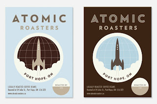
On to the next piece of packaging delights. Atomic Roasters Coffee packaging has a great retro look and feel with some great simple imagery backed up with a considered limited colour palette and a lovely set of simple information icons to be used on the various packs.
Quite a simple design next but still a lovely detailed re brand. Granny's Secret is a range of organic food products. I especially like the little labels which detail how much fruit goes into the products. A nice simple addition along with the delicate die cut label which has an old fashioned doily effect to re-enforce the 'granny' aspect of the brand name.
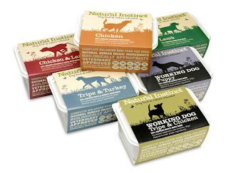
Pet food isn't known for being that exciting to look at but the Natural Instinct range look great. The original brief was to make the product look more of a premium brand but at the same time enforce the natural ingredients contained within. The simple use of the silhouettes work really well and I like the whole range of colours which work well together as a complete range.
Not quite the last one is Fentimans and Bloom Gin and Tonic. Re branded by Keen and Able in London who have worked on some other great drink packaging. Working on drink brands who have such a long history can be quite difficult as you have to consider there long established place in the market but you then have a great wealth of history and credibility to research and develop from. The colours and type treatment work really well together along with a delicate pattern which backs up the ingredients.
Last but by no means least is a great seasonal approach by Design Bridge for Tate and Lyles black treacle. It is based on their Diamond Jubilee design and features three different treatments that can also be used when empty with candles inside so you can have glowing facial features especially for Halloween. You can also see on the last picture some of the development work from their own website.


No comments:
Post a Comment