So I will start at the first show I visited which was at UWE in Bristol. It is always worth the trip to go an see this show every year because the range of work exhibited is fascinating for such a small campus. The illustration work especially is stunning which never fails to captivate me. This year was no exception.
First I had a look at the photography which is always of a professional standard but as with most degree shows, there is little in the way of commercial work which I always find strange when you are trying to gain employment after University. We all have our favourite things we like to photograph. Mine is finding rusty metal objects at the coast such as old winches or the rusting metal on boats which take on so many amazing colours. But, I wouldn't use them at a degree show and would rather show a more commercial side to my work which could show a potential employer a different vision and capability. They seem a lot more obsessed with the meaning behind the photographs instead of showing that in the pictures.
The Drawing and Applied Arts section of the show is always stunning. Some of my favourites were Rachel Giddon and her work with wasps nests which are fascinating structures. There was a nice juxtaposition between danger and beauty in her concept and the finished results were very engaging to the viewer. Rachel Harriman had created some 3D sculptures which were formed of images of the human body and then repeated and constructed into multi faceted balls which showed the human form in different ways.


Rebecca Furness examined the changing and evolving landscape of the polar regions and how the polar bears are struggling to survive with the ice literally disappearing beneath them. One of her pieces was a sculptured piece showing lots of small polar bear models squashed together on a disappearing iceberg. This was another thought provoking piece which I really liked.

Overall, plenty of thought provoking artwork accompanied by a well produced booklet which is always nice to have so you can reference the artists to watch their progress.
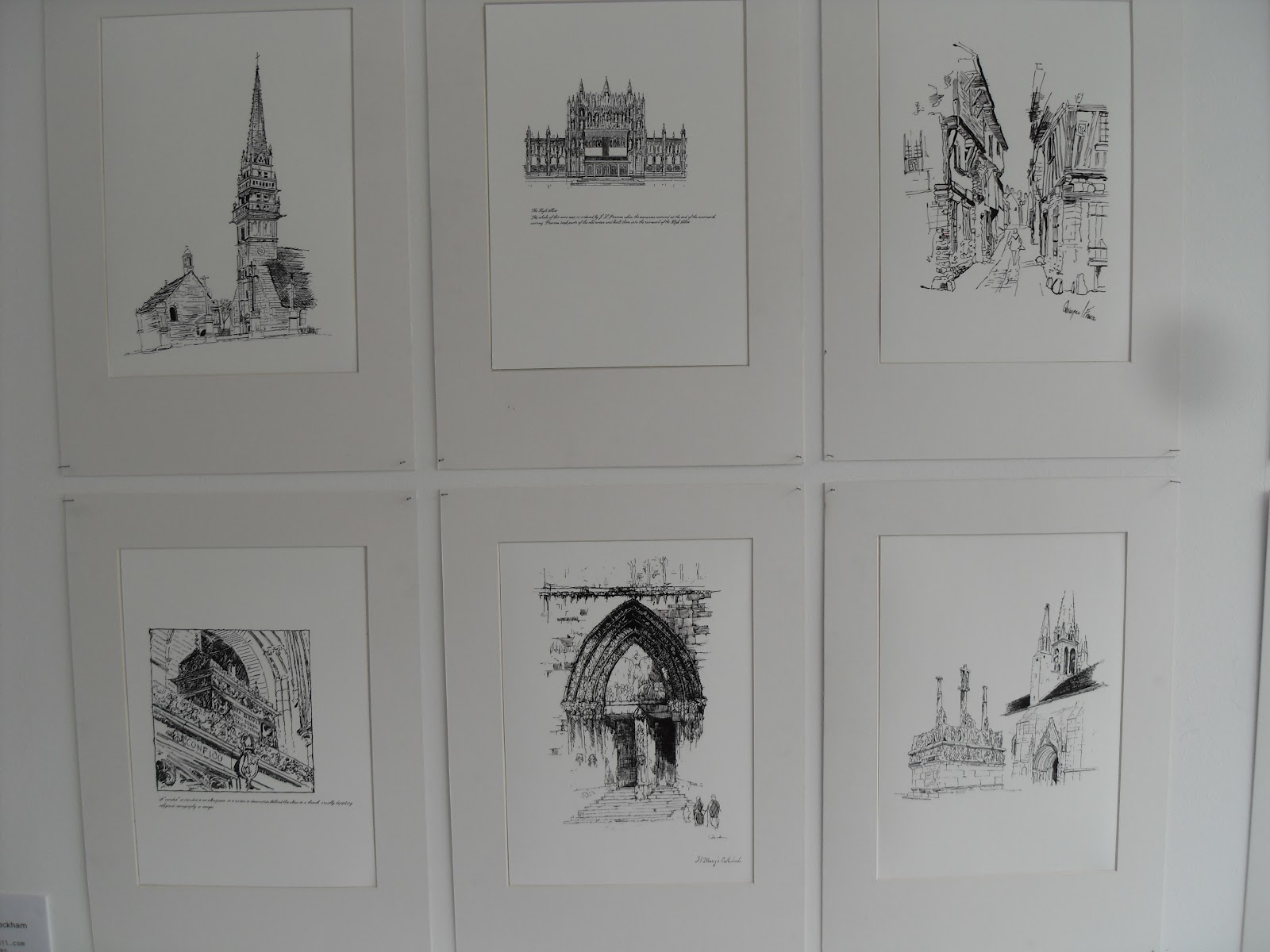
The part I had been waiting for was next, the Illustration exhibits. As I have said before the standard is amazingly high and the look of the show generally is always brilliant.
I have chosen a few favourites first to show which for me, show a fantastic talent when it comes to illustration. The best for me was by Jesse Hodgson. As a children's book illustrator, her pictures are staggeringly amazing. The detail and colours used draw you in to the pictures and would love to get a copy of this book entitled 'Pongo". The pictures I had taken do not do the them justice and neither do the ones off her website as the colours on the originals are fantastic. I found a few of the development pictures for the story as well as the finished examples.


The next is Laura Lane and her story about a shark. Whilst it is a different style of illustration, the pictures show the story perfectly and are equally as engaging as the story.


These were just a small selection of some of the amazing work. Following is a few more of my favourites on the day:


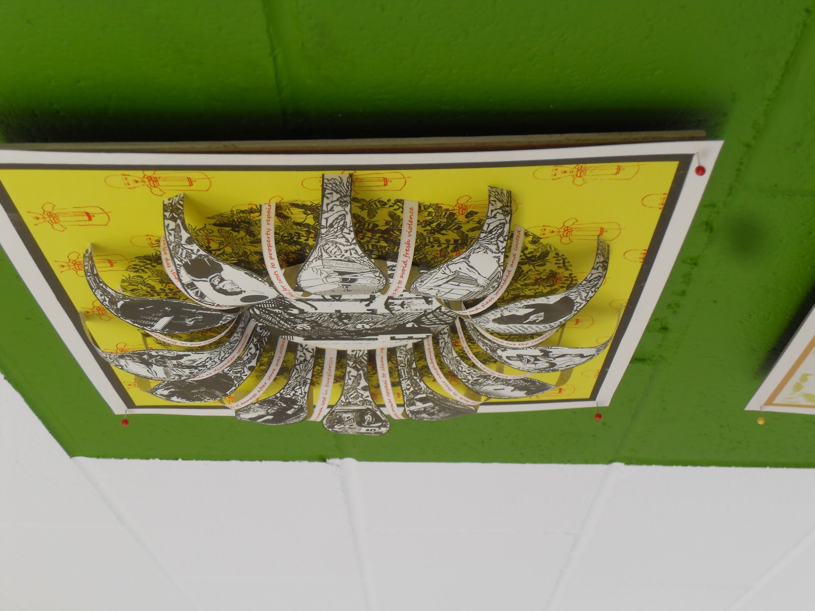
Around the corner for the Illustration rooms was Multidisciplinary Printmaking MA. I had never seen this course exhibiting before but was again amazed by how interesting the work was. Everyone on the course has their own specialism that they chose to expand upon whether it be linocut printing, ceramics etc and then they developed their existing skills into a fuller understanding of the discipline. Some of the work was very well executed, especially when you considered the mediums used such as metal and ceramics. Again a few more examples shown below:


Other parts of the show were Fashion and Animation which I tend to quickly have a look at as I haven't got a strong enough interest in but it's always worth a quick visit.
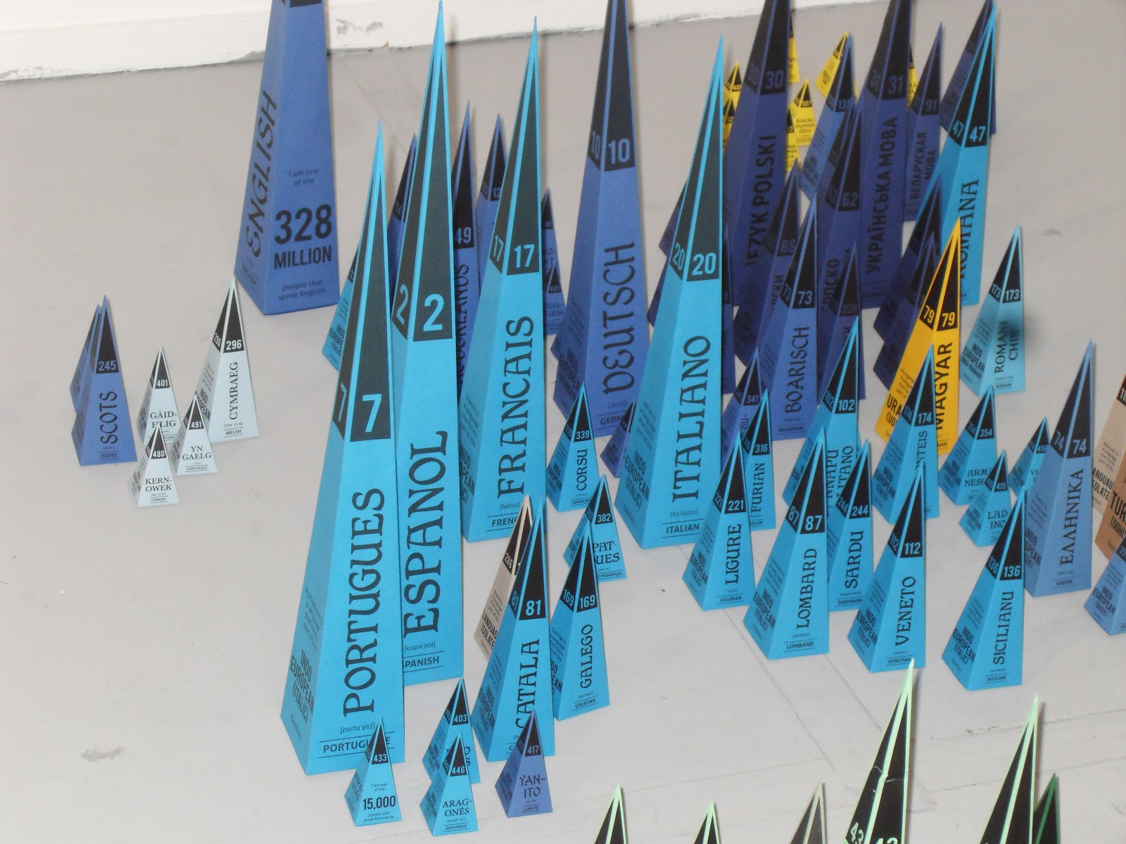
Graphic Design at Bristol has always been a lot different to other degree shows because there has always been a strong leaning towards producing just posters and books. It always seems a weird part of the show to look around as it doesn't strike you as immediately engaging at first but the typography skills are some of the most proficient you will see from students. The posters tend to be very type based and there is always some great infographic work displayed. The books on display vary from professionally produced to a lot of amazing handmade varieties. I think its because there is little variety between the work that some of it gets a bit lost sometimes.


My favourite piece was a rare 3D representative model to illustrate all the different spoken languages around the world. This is what excites me about some graphic design how it instantly can engage you with a simple but great initial idea. Dependent on how many speak that language, the size of the triangle increases so you instantly get a sense of the information. The colours used signify what family of languages that they all belong to and I also liked the considered application of type on each piece.


Following is some general pictures of other work in the exhibition:


I spent over three hours at UWE and enjoyed every minute of it. It has become one of the highlights of the degree show period for me as I always look forward to seeing the great work produced.
On the way back I try and visit the show at Bath which is on a smaller scale but there is always a few nuggets of great work in their show. As I walked into the main room off reception I spotted some great ceramic work which if I am honest, has given me some ideas for some of my own coastal dreams work.


As my camera was starting to lose the will to live due to a depleted battery, I couldn't take as many pictures as I wanted to but still managed to pick a few well chosen favourites. From the main room you find yourself in the Fine Art section which I always like to look at, not that I understand it all the time but the work is always challenging and has a certain aesthetic appeal. The problem with Fine Art as opposed to Graphics is that the meaning behind the pieces are hidden. What I mean by that is, if you didn't have a descriptive piece of text telling you about the piece of art and the meaning behind it, you would never guess it yourself. Where as with Graphic Design, it communicates the message a lot clearer. So, sometimes you come away feeling a bit confused and somehow cheated that you haven't fully understood what the artist is trying to convey and also less intelligent.


Another strange quirk of the building itself is trying to find your way around. I always get lost easily as the wayfinding system they put in place is always very confusing or is it because I fail to understand it! The Graphic Design part of the show was a bit disappointing as most of the work was in their folders awaiting marking so it was difficult to have a look at most of it. The work that was on show was covered by an assortment of boards which didn't seem to have a purpose at all except to fill up the space. I would much rather have had it less cluttered so you could see the work. The one piece I did like was a piece of packaging that could be adapted into a bird feeder once you had finished the product inside.


The last part of the show I visited was the Textile Design. I was really impressed by the standard of work and how professionally it was displayed. You could easily see some of the pattern designs being used commercially. I didn't take a lot of pictures as most Textile and Pattern designers get a bit touchy about copyrighting their designs which is a bit of a grey area as none of the designs have actually been copyrighted. The few pieces I managed to get pictures of were made with cut up sheets of modelling foam that you can buy from any craft and art shop. They must have taken ages to make and they are not very practical but they looked brilliant.


So, overall it was worth the visit again and will look forward to visiting again next year.
As I said at the beginning, not all degree shows live up to the hype. Last year it was Derby that I was disappointed with. Whilst some of the show was good such as the Textiles, the Graphic Design on show wasn't. The main problem was the amount of spelling mistakes and the terrible typography. I suppose it annoys me because at Staffordshire University, I was lucky to be on a course that drummed in to you the importance of the finished product. To always check it for any spelling mistakes and to pay attention to kerning your type properly. So when I see a supposed finished piece with lots of mistakes, it really gets to me. It should be the students responsibility at the end of the day but didn't any of the tutors inspect the work on show?
So that was last year and this year I visited the show at Birmingham University again. As with Bristol, the Illustration work is outstanding and it didn't disappoint again this year. What did was the Graphic Design part of the show. I was shocked how poor some of the finished artworks were. Not only spelling mistakes and bad typography but when photography was used it was either very poorly cut out or out of focus and badly pixelated. Plus some of the mounting of the work was disgusting. How is someone going to get a job when they can't even be bothered to mount their work properly. It just showed a complete lack of respect in their own work. Unfortunately whilst I was looking at one piece of work, the student whose work it was approached me and asked me what I thought. Now there are always two ways of dealing with these situations. Lie or tell the truth. On this occasion I asked him if he wanted me to be honest. Overall I pointed out over 20 mistakes with his work. Now I am not big headed enough to criticise someone on their ideas and their technical ability because I am still not a professional designer myself, but they were all really obvious mistakes to do with spelling, kerning, print quality and how it was mounted. He also showed me his portfolio which was also poorly presented in plastic sleeves which had been used several times and looked really tatty. Plus the printing itself wasn't very good.
The only benefit to me is that with portfolios of that standard, it helps me gain more placements with mine. This may sound harsh but placements are becoming harder to get and its all about survival of the fittest unfortunately. Ultimately, going to these degree shows gives me a chance to scope out the competition and see how they present their work and see if I can make any improvements to my own portfolio of work. So far, with a few more improvements and a few more pieces of packaging work partnered with a few carefully considered examples of branding, I should be in a good position to gain more placements or ultimately a job.
No comments:
Post a Comment