Thursday, 4 October 2012

Bigger Scale Graphics

Most of my bookmarks on my computer are either packaging designs, architecture or type projects. What I really like to see is a combination. When typography is used in a building to inform and educate in a contemporary fashion, that's what really inspires me.

Paula Scher has been involved with some great projects in the past which I have enjoyed seeing, such as the New jersey Performing Arts Centre which had a typographic face lift. shown below.


On Architype Review, I came across another project that Paula and Pentagram have been involved with for the First Endeavour Middle School. If only my schools had been so interesting instead of drab post Victorian grey boxes. It's been said countless times about having an interesting environment to work in produces greater results but still we build and decorate educational and corporate establishments to be conformist and dull. Architects should make these spaces somewhere that you don't mind spending time in instead of constantly waiting for the clock to turn round to going home time.

The ideas for the slogans themselves actually came form the teachers who had used them in some of their lectures to students. The students also were encouraged to use them as stickers for their lockers or on their sketchbooks which obviously helps reinforce the messages. I also like how they are visible from the street as well so it helps the building exterior to look more vibrant and to bring the inside out and vice versa. Its amazing what you can do with a few tins of paint and a few stencils!


Its such a great idea and a cost effective solution to lift an interior. I would love to design something similar for a supermarket. Just think of the fun you could have with type and imagery in those massive spaces instead of what we have to put up with now. In fact i might try and put together some visuals to see how it would look and you never know, there might be the opportunity in the near future to put it into action somewhere. It might be easier to start with a smaller chain of stores who need their profile raising especially as it is not a costly project to achieve in terms of materials and is mostly labour costs.

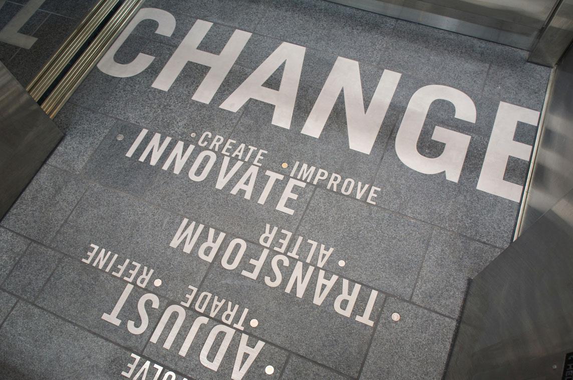
Another project that caught my eye was for the University of Washington. Where their School of Art is based, sits next to the School of Business and they wanted something to link the two together. The concept by Studio Matthews and Karen Chung was to use type to integrate into the fabric of the building and to utilise the movement of the elevators in the new building. On every floor is the word Change along with different phrases which interlink to form new phrases. They also used loose change coins from different countries to symbolise the diversity of the University.




Wednesday, 26 September 2012

Summer Is Over

If you blinked, you missed it. Summer is over for another year as the rain has decided to make yet another appearance. It doesn't seem like five minutes that I was basking in the Olympic Stadium in stifling hot conditions, moaning about how hot I was. How many weeks now till Christmas?

Anyway, I have had plenty of time to reflect on my situation lately as after a few more disappointing job interviews, I am left wondering what to do for the best. I have changed my CV on numerous occasions and had meetings with careers advisors on the best way to approach applications and interviews but with no success.

I started along this new path a few years ago with some trepidation as I knew in my heart that I should have done it years ago but nevertheless, being bloody minded and stubborn, I felt that I could achieve my goals. The reality is that being employed again isn't going to happen. So, the last few days, other than being a miserable pain in the arse and realising that I have to pick myself up yet again, it's time for action!

Having realised that a lot of my fellow students have picked the business modules, the best course of action is not just to gain the knowledge but to put it into action as I work my way through. The eventual goal is to end up at the end of this course not only with an MA but also a working design studio practice. I have played at it a few times in the past but never seriously if I am to be honest with myself. I think in reality, having always worked for someone else, I am scared of going it alone. I read about lots of students who set up their own studios out of University and its easier because they haven't had that security of a monthly income and haven't been tainted by being employed by somebody else telling you what to do all day. Towards the end I was in a position where I could delegate to others but I was still answerable to someone else everyday. Plus, I really wanted to be in an environment where you had other human beings to talk to and other designers who you could share your ideas with. You end up in a sterile bubble working from home and I think your work suffers because of it.

So it's back to it on Friday and I am going to see what the modules are all about and formalise a plan over the weekend. After all, I don't want to in another 10 years time, still be cutting bits of card up, DJing to drunks and pretending I am Hank Marvin at the weekend!

Packaging Round Up

Just a few of my current favourites at the moment.

First up we have a range of luxury biscuits designed by the Edinburgh based Threebrand. It isn't very often that I want to buy something just for the packaging but these are on my list, especially when one of them is lemon meringue flavoured shortbread. It doesn't get much better.

There are so many features that I like from the subtle printing techniques to the typography used. The diet can start the week after.


The second is a new brand of juice drinks from Australia. Their target audience is women or people over 40 who they feel have stopped using juice products because they tend to worry more about their daily calorie intake. Part of their blurb states that, 'the visual identity for this brand is driven around a contemporary expression of innocence and purity, combined with a feminine elegance'.

Whilst I was initially drawn to the logotype on the bottles, I am not quite sure about the design as a whole. The apple illustration works hanging off a stem but I have never seen sliced pineapple hanging off a branch! It just doesn't look right and I feel they should have approached it a bit better.


I did a blog about Johnnie Walker before and the great limited edition bottles. Now to celebrate the year of the dragon, Love have designed some limited edition boxes with the help of Chris Martin again. The full illustration is shown below:

I really liked the earlier designs he did on the blue designed bottles and these are no less brilliant. Some of the detail on the clouds and waves are very indicative of traditional Chinese prints.


Next is a new line of olive oil products. These stood out because I like the illustrations and there chosen subtle colours. The name Elia is from a Greek word which literally translates as Olive. Thinking about how olive oil looks on the supermarket shelves at the moment I don't think these would look quite right.    I can understand them wanting a more feminine look but they look more like a beauty product that you would find in Boots or Body Shop.


When it comes to pieces of self promotional material, I always find them a bit too cheesy or wonder how they can afford to make them and send them through the post. As i always say it is just my opinion but here is one that looks really good and another that doesn't cut it for me.

First the good one. Greg Straight is an amazing Illustrator based in New Zealand and he wanted something that could be used to encapsulate his work and show what he was capable of. His finished design is a lovely piece of cut corrugated card that when it arrives on a desk, you cannot wait to open it and look inside. The original premise was to send it to Wallpaper magazine because he had met the Art Director at an exhibition and wanted to impress on him that he could be the Illustrator they were looking for. So along with some help from Think Packaging, Greg now has a great, simple piece of self promotion.


Now for the least favourite of mine. The idea has been used a few times before but when it is designed and executed properly, the results can be very good. But in this case, it doesn't work for me.

One of my favourite films as a child has to be the original Willy Wonka due in part to the wonderful Gene Wilder but its also the sweet shop with its mind boggling array of different sweets. I don't have to go into much detail but needless to say it was all about finding the golden ticket.

Charlotte Olsen wanted to design something to use as a piece of self promotion that would make her stand out and also show a bit of her fun personality. If you are going to mimic a golden ticket then the least you can do is try to make it look like a golden ticket and not just like a normal bit of paper that you have printed at home. Plus why would you offer a 10% discount if you really have 100% raw talent in the first place. It doesn't bode well if you are already underselling yourself, surely. Also, I really do not like how she has split the word 'talent' on the main wrap. Its a shame because it could have been executed so much better but it has ended up looking quite poor in my opinion.