Just a few of my current favourites at the moment.
First up we have a range of luxury biscuits designed by the Edinburgh based Threebrand. It isn't very often that I want to buy something just for the packaging but these are on my list, especially when one of them is lemon meringue flavoured shortbread. It doesn't get much better.
There are so many features that I like from the subtle printing techniques to the typography used. The diet can start the week after.
The second is a new brand of juice drinks from Australia. Their target audience is women or people over 40 who they feel have stopped using juice products because they tend to worry more about their daily calorie intake. Part of their blurb states that, 'the visual identity for this brand is driven around a contemporary expression of innocence and purity, combined with a feminine elegance'.
Whilst I was initially drawn to the logotype on the bottles, I am not quite sure about the design as a whole. The apple illustration works hanging off a stem but I have never seen sliced pineapple hanging off a branch! It just doesn't look right and I feel they should have approached it a bit better.
I did a blog about Johnnie Walker before and the great limited edition bottles. Now to celebrate the year of the dragon, Love have designed some limited edition boxes with the help of Chris Martin again. The full illustration is shown below:
I really liked the earlier designs he did on the blue designed bottles and these are no less brilliant. Some of the detail on the clouds and waves are very indicative of traditional Chinese prints.
Next is a new line of olive oil products. These stood out because I like the illustrations and there chosen subtle colours. The name Elia is from a Greek word which literally translates as Olive. Thinking about how olive oil looks on the supermarket shelves at the moment I don't think these would look quite right. I can understand them wanting a more feminine look but they look more like a beauty product that you would find in Boots or Body Shop.
When it comes to pieces of self promotional material, I always find them a bit too cheesy or wonder how they can afford to make them and send them through the post. As i always say it is just my opinion but here is one that looks really good and another that doesn't cut it for me.
First the good one. Greg Straight is an amazing Illustrator based in New Zealand and he wanted something that could be used to encapsulate his work and show what he was capable of. His finished design is a lovely piece of cut corrugated card that when it arrives on a desk, you cannot wait to open it and look inside. The original premise was to send it to Wallpaper magazine because he had met the Art Director at an exhibition and wanted to impress on him that he could be the Illustrator they were looking for. So along with some help from Think Packaging, Greg now has a great, simple piece of self promotion.
Now for the least favourite of mine. The idea has been used a few times before but when it is designed and executed properly, the results can be very good. But in this case, it doesn't work for me.
One of my favourite films as a child has to be the original Willy Wonka due in part to the wonderful Gene Wilder but its also the sweet shop with its mind boggling array of different sweets. I don't have to go into much detail but needless to say it was all about finding the golden ticket.
Charlotte Olsen wanted to design something to use as a piece of self promotion that would make her stand out and also show a bit of her fun personality. If you are going to mimic a golden ticket then the least you can do is try to make it look like a golden ticket and not just like a normal bit of paper that you have printed at home. Plus why would you offer a 10% discount if you really have 100% raw talent in the first place. It doesn't bode well if you are already underselling yourself, surely. Also, I really do not like how she has split the word 'talent' on the main wrap. Its a shame because it could have been executed so much better but it has ended up looking quite poor in my opinion.
Wednesday, 26 September 2012
Wednesday, 5 September 2012
Playing Catch Up!!
The last couple of weeks have seen me very busy trying to make new things for Coastal Dreams and trying to sort out a new website for it. The website is next on the list and has had to take a bit of a back seat as I have been involved with a pop up shop and a few opportunities on various market stalls.
Firstly, the pop up shop was really good and got me some great exposure on the Lichfield High Street. I had two consecutive Saturday's in a great position. It has proved that the idea is sound as everyone loved the stall and it brought back a lot of childhood holiday memories for people, which is what i was hoping for. The only downside to designing coastal inspired artworks is that it is quite seasonal and as there are quite a few Christmas craft markets coming up, I am wondering if I should make up all my Christmas inspired pieces as well. Not quite sure how they would sit together on a website though, even if I made sure they were in different sections. More thoughts needed.
The reason I am playing catch up is that I have slightly taken my eye of the latest packaging designs from my various sourced websites. I suppose it may also be the case of how many jobs I have been applying for as well which can be quite time consuming and also pretty tedious!
So, on to my current favourites of the last few weeks which have caught my eye.
The first one touches a nerve to be honest. Not because the packaging design itself but the awful way that companies farm for work using crowdsourcing. No wonder it is getting harder to convince a client that you are the right person for the job when they believe any Tom, Dick or Harry on Facebook or Twitter can do the same job. Link this with the world of unpaid pitching and you have a very bleak picture for the industry. It is alright for the major players in the industry as they can afford to ride the storm somewhat but for the smaller agencies and freelancers, how are you supposed to compete.
Wyke farm's range of cheeses has had a facelift which was initially put out to tender to a few select design agencies but then in their supposed wisdom, decided to rely on its fans on Facebook to help! Now I am all for social media and I do like using it daily but I feel this was a step too far.
It has just showed how the company couldn't put their faith in the talents of an agency or even pay the going rate for the work. On the Design Week website it states that Wyke Farms said, " the company was committed to accepting the wisdom of the crowd" In my opinion they need committing for allowing the design process to be trivialised on social media.
These are the sort of packaging designs that really appeal and I am sometimes quite envious of that I didn't think of it first. I really like the story idea as it makes the brand come alive and makes it easier to engage with.
BrandOpus have recently re branded Butterkist Popcorn. The reason I chose this was I really like how the design subtly uses cues from the golden age of cinema, especially when you look at some of the old film producer logos. Whilst the main Butterkist logotype stays the same, each different flavour has had a different type treatment. Very nice and a definite improvement from the old design.
One of my favourite sources for new Packaging Design is the Dieline website. I feel like I have been missing out these last few weeks as I haven't had much chance to catch up on some of the latest designs until now.
First, a student design for a brand of Limoncello. Besides liking the drink anyway, I love how bright and vibrant the new designs are. I hope that there is a chance these go into production because they would look fantastic on the shelf and I can see these gracing the tables of Italian cafe's. To be honest, if these were going into production, I would buy the set along with the glasses just to look at. Designed by Tiffany Moy who is studying at the Academy of Art in San Francisco, the idea came from researching Italian ceramic painting and the floral design of the fruit plants.
As an homage to the Andy Warhol's work based around his Campbells Soup Cans and also to coincide with it's 50th Anniversary, they have produced some limited edition labels for their condensed soup range. I think this was a great idea to celebrate one of the icons of Pop Art and it doesn't do any harm to keep reminding people what a great artist he was. His soup can pictures were extremely iconic and have been reproduced over and over again because of their bright colours and readily accessible subject matter.
Lastly, I have picked another nice piece of simple typography. A new range of Organic Baby Food called So Baby has just launched with a really nice considered design by the agency Mayday. They are one of my favourite agencies because I really liked their work for Clearspring which has some great simple graphic design along with some lovely considered embossing on the packs.
The pack designs for So Baby are very fresh with a thoughtful colour palette. There are also some nice bits of illustration which blend effortlessly together with the overall brand design. What I also liked is the pack design which looks very similar to the Food Doctor range of snacks which uses a plastic container enclosed with a cardboard wrap which gives you a lot more surface area to print all of the legal requirements away from the main focus of the brand design logo.
So that's a quick roundup of some of my favourites at the moment. As I said previously, we are off to the Paralympic Games on Friday where we have tickets for the Athletics inside the Olympic Stadium which we are all very excited about. Hoping to get some good photographs this time as I am taking the better camera with me so looking forward to photographing a few 'arty' shots.
I don't want to dwell on it too much but at the moment, the plans are not working out at the moment so i am having to pick myself up yet again and refocus on something more positive. Unfortunately I am having to return to the dreaded world of being a mobile DJ until Christmas, just to get some much needed money. This is going to be harder than it seems because the reason I packed it in last time was due to getting very fed up with having to deal with stupid, drunk and abusive people. Trust me there is nothing worse than being stone cold sober having to deal with alcohol abusers!
So because I am getting no design work or job opportunities at the moment, I have recently changed my CV yet again which seems to be getting a few more replies. Also, I need to produce a lot more work in terms of a portfolio. The latest plan is to get nearly a dozen more packaging designs completed for a solely specialist portfolio. Then I really could do with some more obvious graphic design examples such as basic branding, leaflets, posters, newsletters etc etc. It may be alright when going solely for Packaging Design positions but I am having to lower my sights and need some credible, well produced commercial work so at least I have a better chance of getting an entry level position which then allows me some income to pursue my dreams of becoming a Packaging Designer.
That's more than enough waffling for now as I need a cup of tea.
Firstly, the pop up shop was really good and got me some great exposure on the Lichfield High Street. I had two consecutive Saturday's in a great position. It has proved that the idea is sound as everyone loved the stall and it brought back a lot of childhood holiday memories for people, which is what i was hoping for. The only downside to designing coastal inspired artworks is that it is quite seasonal and as there are quite a few Christmas craft markets coming up, I am wondering if I should make up all my Christmas inspired pieces as well. Not quite sure how they would sit together on a website though, even if I made sure they were in different sections. More thoughts needed.
The reason I am playing catch up is that I have slightly taken my eye of the latest packaging designs from my various sourced websites. I suppose it may also be the case of how many jobs I have been applying for as well which can be quite time consuming and also pretty tedious!
So, on to my current favourites of the last few weeks which have caught my eye.
The first one touches a nerve to be honest. Not because the packaging design itself but the awful way that companies farm for work using crowdsourcing. No wonder it is getting harder to convince a client that you are the right person for the job when they believe any Tom, Dick or Harry on Facebook or Twitter can do the same job. Link this with the world of unpaid pitching and you have a very bleak picture for the industry. It is alright for the major players in the industry as they can afford to ride the storm somewhat but for the smaller agencies and freelancers, how are you supposed to compete.
Wyke farm's range of cheeses has had a facelift which was initially put out to tender to a few select design agencies but then in their supposed wisdom, decided to rely on its fans on Facebook to help! Now I am all for social media and I do like using it daily but I feel this was a step too far.
It has just showed how the company couldn't put their faith in the talents of an agency or even pay the going rate for the work. On the Design Week website it states that Wyke Farms said, " the company was committed to accepting the wisdom of the crowd" In my opinion they need committing for allowing the design process to be trivialised on social media.
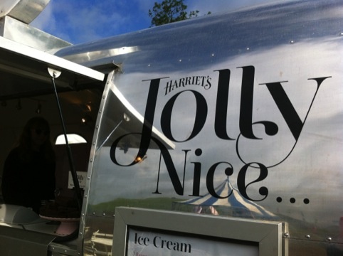
Another of my favourite agencies, Taxi Studio have just worked on the re brand of Westonbirt Ice Cream. Now called Harriet's Jolly Nice, I really like the typographic treatment of the name and the choice of colour palette. I also like the fact that there is a different charming story associated with each different flavour.
These are the sort of packaging designs that really appeal and I am sometimes quite envious of that I didn't think of it first. I really like the story idea as it makes the brand come alive and makes it easier to engage with.
BrandOpus have recently re branded Butterkist Popcorn. The reason I chose this was I really like how the design subtly uses cues from the golden age of cinema, especially when you look at some of the old film producer logos. Whilst the main Butterkist logotype stays the same, each different flavour has had a different type treatment. Very nice and a definite improvement from the old design.
One of my favourite sources for new Packaging Design is the Dieline website. I feel like I have been missing out these last few weeks as I haven't had much chance to catch up on some of the latest designs until now.
First, a student design for a brand of Limoncello. Besides liking the drink anyway, I love how bright and vibrant the new designs are. I hope that there is a chance these go into production because they would look fantastic on the shelf and I can see these gracing the tables of Italian cafe's. To be honest, if these were going into production, I would buy the set along with the glasses just to look at. Designed by Tiffany Moy who is studying at the Academy of Art in San Francisco, the idea came from researching Italian ceramic painting and the floral design of the fruit plants.
As an homage to the Andy Warhol's work based around his Campbells Soup Cans and also to coincide with it's 50th Anniversary, they have produced some limited edition labels for their condensed soup range. I think this was a great idea to celebrate one of the icons of Pop Art and it doesn't do any harm to keep reminding people what a great artist he was. His soup can pictures were extremely iconic and have been reproduced over and over again because of their bright colours and readily accessible subject matter.
Lastly, I have picked another nice piece of simple typography. A new range of Organic Baby Food called So Baby has just launched with a really nice considered design by the agency Mayday. They are one of my favourite agencies because I really liked their work for Clearspring which has some great simple graphic design along with some lovely considered embossing on the packs.
The pack designs for So Baby are very fresh with a thoughtful colour palette. There are also some nice bits of illustration which blend effortlessly together with the overall brand design. What I also liked is the pack design which looks very similar to the Food Doctor range of snacks which uses a plastic container enclosed with a cardboard wrap which gives you a lot more surface area to print all of the legal requirements away from the main focus of the brand design logo.
So that's a quick roundup of some of my favourites at the moment. As I said previously, we are off to the Paralympic Games on Friday where we have tickets for the Athletics inside the Olympic Stadium which we are all very excited about. Hoping to get some good photographs this time as I am taking the better camera with me so looking forward to photographing a few 'arty' shots.
I don't want to dwell on it too much but at the moment, the plans are not working out at the moment so i am having to pick myself up yet again and refocus on something more positive. Unfortunately I am having to return to the dreaded world of being a mobile DJ until Christmas, just to get some much needed money. This is going to be harder than it seems because the reason I packed it in last time was due to getting very fed up with having to deal with stupid, drunk and abusive people. Trust me there is nothing worse than being stone cold sober having to deal with alcohol abusers!
So because I am getting no design work or job opportunities at the moment, I have recently changed my CV yet again which seems to be getting a few more replies. Also, I need to produce a lot more work in terms of a portfolio. The latest plan is to get nearly a dozen more packaging designs completed for a solely specialist portfolio. Then I really could do with some more obvious graphic design examples such as basic branding, leaflets, posters, newsletters etc etc. It may be alright when going solely for Packaging Design positions but I am having to lower my sights and need some credible, well produced commercial work so at least I have a better chance of getting an entry level position which then allows me some income to pursue my dreams of becoming a Packaging Designer.
That's more than enough waffling for now as I need a cup of tea.
The Olympic Flame
Whilst I have been an avid viewer of the Olympic coverage and even been lucky enough to get tickets for the Women's Hockey which was a fantastic day out, (off to the Paralympic Games tomorrow), the one feature that really stood out for me from a design perspective was the Olympic Cauldron.
It was designed by Thomas Heatherwick Studio which was also responsible for some of my other favourite pieces of architecture, namely the East Beach Cafe and the great mesh delight at Guys Hospital.
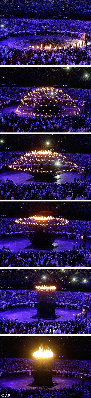
It may be our Olympics and of course we are going to be slightly biased but this design for the Cauldron has to be the best ever. When I was watching it and wondering how they were going to light it and wondering why everyone was carrying these strange shaped metal objects in to the Stadium. I was so fascinated when the arms started to rise up to join together in the middle that my jaw must have been nearly on the floor. It is a piece of stunning engineering and design that I am looking forward to seeing in the flesh on Friday. It isn't very often that you would use the words engineering and beautiful in the same sentence but it was a beautiful moment for me seeing it being lit and rising up.
Also, when the Olympics has ended and it is time to extinguish the flame it has always seemed like a non event but this time when it was the end of the games, watching the arms slowly falling down and the individual flames going out, it was quite emotional and made for a stunning spectacle and one that will live in my memory for years to come.
It was designed by Thomas Heatherwick Studio which was also responsible for some of my other favourite pieces of architecture, namely the East Beach Cafe and the great mesh delight at Guys Hospital.
It may be our Olympics and of course we are going to be slightly biased but this design for the Cauldron has to be the best ever. When I was watching it and wondering how they were going to light it and wondering why everyone was carrying these strange shaped metal objects in to the Stadium. I was so fascinated when the arms started to rise up to join together in the middle that my jaw must have been nearly on the floor. It is a piece of stunning engineering and design that I am looking forward to seeing in the flesh on Friday. It isn't very often that you would use the words engineering and beautiful in the same sentence but it was a beautiful moment for me seeing it being lit and rising up.
Also, when the Olympics has ended and it is time to extinguish the flame it has always seemed like a non event but this time when it was the end of the games, watching the arms slowly falling down and the individual flames going out, it was quite emotional and made for a stunning spectacle and one that will live in my memory for years to come.
Monday, 20 August 2012
An Old Tin Can?
Well after a much needed holiday at Sunny Exmouth, it's back to the mundane business of checking in about any outstanding job applications. Out of a dozen applications I have been shortlisted for .........none of them!
The one where I thought I stood a good chance, the Artworker role in Birmingham has gone to someone else. In fact there were 3 or 4 roles and I didn't get one of them. What makes this worse is that someone who was on the same BA course as me is working there at the moment, so this makes it even more embarrassing that I didn't get a job there. To be honest, if I can't even get an Artworker role, the future is looking really bleak at the moment. Hence the title of this being An Old Tin Can. I do feel like I am being kicked around all over the place and no one is willing to pick me up.
When I look at my CV and portfolio, it still looks like I have so much to offer, so why is it not happening. I am loathe to admit it but I do think that if I was twenty years younger, I would have a design job by now. This isn't just a case of self pity but thinking about most interviews I have gone for and when being showed around the various studios, most of the designers are in their twenties. Even some of the Creative Directors I have met are only in their mid thirties, early forties.
To be frank, I am sick and tired of being kicked around and am despondent about my design career. It is looking more likely that I am going to have to bite the bullet and apply for more mundane roles just to earn some money. Maybe it is a case of finishing my degree, having thoroughly enjoyed the last few years and then putting it all in a box and throwing away the key for good. I have even applied for lots of jobs with companies like Argos, John Lewis, Tesco etc, and still cannot manage to even get an interview. These are not for demanding roles but for positions such as Van Driver, Stock Assistant or even basic Call Centre roles.
People who know me well cannot ever say that I am not persistent but I don't know which way to turn any more. Whilst I am enjoying my endeavours with Coastal Dreams, it is unlikely that I will even make minimum wage as an income from it. At best it is going to be a self funding hobby and not a future career move. I will still continue to design more artworks and make more pictures but it does take a lot of effort and time which could be spent on something more financially rewarding.
So having checked all my emails and phoned round any outstanding messages, there is a possibility of an interview later this week for a part time call centre role in Birmingham. Not quite what I had in mind but we will wait and see.
Some people always say what they would do if they could go back in time to when they were younger and what they would do. Well I already know the answer to that one.............
The one where I thought I stood a good chance, the Artworker role in Birmingham has gone to someone else. In fact there were 3 or 4 roles and I didn't get one of them. What makes this worse is that someone who was on the same BA course as me is working there at the moment, so this makes it even more embarrassing that I didn't get a job there. To be honest, if I can't even get an Artworker role, the future is looking really bleak at the moment. Hence the title of this being An Old Tin Can. I do feel like I am being kicked around all over the place and no one is willing to pick me up.
When I look at my CV and portfolio, it still looks like I have so much to offer, so why is it not happening. I am loathe to admit it but I do think that if I was twenty years younger, I would have a design job by now. This isn't just a case of self pity but thinking about most interviews I have gone for and when being showed around the various studios, most of the designers are in their twenties. Even some of the Creative Directors I have met are only in their mid thirties, early forties.
To be frank, I am sick and tired of being kicked around and am despondent about my design career. It is looking more likely that I am going to have to bite the bullet and apply for more mundane roles just to earn some money. Maybe it is a case of finishing my degree, having thoroughly enjoyed the last few years and then putting it all in a box and throwing away the key for good. I have even applied for lots of jobs with companies like Argos, John Lewis, Tesco etc, and still cannot manage to even get an interview. These are not for demanding roles but for positions such as Van Driver, Stock Assistant or even basic Call Centre roles.
People who know me well cannot ever say that I am not persistent but I don't know which way to turn any more. Whilst I am enjoying my endeavours with Coastal Dreams, it is unlikely that I will even make minimum wage as an income from it. At best it is going to be a self funding hobby and not a future career move. I will still continue to design more artworks and make more pictures but it does take a lot of effort and time which could be spent on something more financially rewarding.
So having checked all my emails and phoned round any outstanding messages, there is a possibility of an interview later this week for a part time call centre role in Birmingham. Not quite what I had in mind but we will wait and see.
Some people always say what they would do if they could go back in time to when they were younger and what they would do. Well I already know the answer to that one.............
Wednesday, 8 August 2012
Job Interviews
Like a dog with a bone, I am determined to get somewhere this year and have had some responses to a few job applications this week which have been positive. Today I went to an advertising agency in Birmingham for an Artworker role. It is working shifts but as it is only a half hour drive away, I don't really mind. Plus it will bring in some much needed money.
The agency that rang me about the job said it was a small agency of about 15 people who have a small office in the new Fort Dunlop building by the Fort Shopping Centre. It turned out to be more like 100 people working there and they have an amazing list of clients on their books. I don't want to name names just in case but they have worked for what seems most of the retail brands you can think of! So the interview went really well and I think I made a good impression. I didn't have to talk through my portfolio for a change either as they had seen it from my emails and were suitably impressed with the attention to detail. All I have to do now is to attend again and sit an informal test on a Mac to see if I am capable of the work involved. Needless to say I will be taking my Mac on holiday next week and polishing up a few grey areas in my knowledge before the following week. It would be an ideal role for me working in Birmingham at an agency that runs and works like the top London equivalents. Just got to play the waiting game again.
Thursday, 2 August 2012
Amazing Olympic Experience
This week has been a very special one as we managed to get some tickets last minute for the Olympics. We saw GB take on Korea in the Women's Hockey. It is hard to put the whole day in to words as it was a strangely emotional experience. We had heard, like everyone else how chaotic it was trying to get in, the empty seats, extortionate prices and how disorganised it was but the truth is, that is a load of rubbish!
The experience starts from when you board the train as nearly every station has volunteers helping and showing you the way. When you arrive at Stratford Station there are masses of volunteers there to greet you, all smiling and eager to share your experience. Getting through security is very well organised and again everyone is so helpful and enthusiastic.
Then you have a long walk to the park itself which is when the realisation starts to set in that you are actually at the Olympics.
The park itself is breathtaking and it's only then that you get a sense of how big the buildings are. Where we entered was past the swimming arena and you could hear the crowds cheering from outside. As soon as you see the stadium itself, it does bring a lump to your throat and a real sense of pride of what the country has achieved. Instead of criticising all the time, we should take credit more for this achievement. Yes it has cost lots of money and yes the sponsorship regulations have annoyed us all but honestly, as soon as you are there, you forget all about it.
We couldn't wait to get into the Riverbank Arena to see the Hockey and as we walked across the park to the Riverbank Arena, we were in awe of how big it was considering it is only a temporary structure. Inside, the atmosphere was breathtaking. Luckily we had two matches to look forward to. First we supported Belgium in there match which was quite evenly matched to be honest but then, as soon as Great Britain came out to warm up the crowd erupted and the noise was deafening. We couldn't have got better tickets if we tried, the game was brilliant to watch all the way through and they did us proud by winning 5-3. I have never been that excited at a hockey match in my life but I still have got a sore throat from shouting too much.
Our Olympic experience gets better though. We also purchased some tickets for Womens Football at the Coventry Arena for tomorrow. We had no idea who was playing but it was a fair bet that one of the teams was going to be Brazil. But we learnt yesterday that the GB team beat them 1-0, so we are now watching GB in action tomorrow night which is another stroke of luck.
To top it all off, today we were talking about how exciting it would have been to get a ticket inside the actual Olympic Stadium. You can't see the Olympic flame from outside and it would have been great but those are the most prized tickets to get hold of. Then I thought about the Paralympic Games which are following a couple of weeks after, so after a lot of website page refreshing, I managed to get hold of some tickets for a Friday in the stadium. This time we are taking both parents as well so it will be a great family occasion to share and no doubt lots more pictures and lots more memories.
Also as i write this, today we have got a gold in the Shooting and an amazing Gold and Silver in the Kayak. I have never watched so much sport in my life as I have no interest at all in mainstream sports, especially men's football. After watching the hockey and seeing how they have the video decisions, it would make football better as it would stop all the bad behaviour and no more pathetic diving.
Anyway, enough excited ramblings and back to the TV. GO GO GB.....GO GO GB........
The experience starts from when you board the train as nearly every station has volunteers helping and showing you the way. When you arrive at Stratford Station there are masses of volunteers there to greet you, all smiling and eager to share your experience. Getting through security is very well organised and again everyone is so helpful and enthusiastic.
Then you have a long walk to the park itself which is when the realisation starts to set in that you are actually at the Olympics.
The park itself is breathtaking and it's only then that you get a sense of how big the buildings are. Where we entered was past the swimming arena and you could hear the crowds cheering from outside. As soon as you see the stadium itself, it does bring a lump to your throat and a real sense of pride of what the country has achieved. Instead of criticising all the time, we should take credit more for this achievement. Yes it has cost lots of money and yes the sponsorship regulations have annoyed us all but honestly, as soon as you are there, you forget all about it.
We couldn't wait to get into the Riverbank Arena to see the Hockey and as we walked across the park to the Riverbank Arena, we were in awe of how big it was considering it is only a temporary structure. Inside, the atmosphere was breathtaking. Luckily we had two matches to look forward to. First we supported Belgium in there match which was quite evenly matched to be honest but then, as soon as Great Britain came out to warm up the crowd erupted and the noise was deafening. We couldn't have got better tickets if we tried, the game was brilliant to watch all the way through and they did us proud by winning 5-3. I have never been that excited at a hockey match in my life but I still have got a sore throat from shouting too much.
Our Olympic experience gets better though. We also purchased some tickets for Womens Football at the Coventry Arena for tomorrow. We had no idea who was playing but it was a fair bet that one of the teams was going to be Brazil. But we learnt yesterday that the GB team beat them 1-0, so we are now watching GB in action tomorrow night which is another stroke of luck.
To top it all off, today we were talking about how exciting it would have been to get a ticket inside the actual Olympic Stadium. You can't see the Olympic flame from outside and it would have been great but those are the most prized tickets to get hold of. Then I thought about the Paralympic Games which are following a couple of weeks after, so after a lot of website page refreshing, I managed to get hold of some tickets for a Friday in the stadium. This time we are taking both parents as well so it will be a great family occasion to share and no doubt lots more pictures and lots more memories.
Also as i write this, today we have got a gold in the Shooting and an amazing Gold and Silver in the Kayak. I have never watched so much sport in my life as I have no interest at all in mainstream sports, especially men's football. After watching the hockey and seeing how they have the video decisions, it would make football better as it would stop all the bad behaviour and no more pathetic diving.
Anyway, enough excited ramblings and back to the TV. GO GO GB.....GO GO GB........
Subscribe to:
Posts (Atom)